Why Custom Illustrations Make Brands More Memorable
Stock images and illustrations, generic visuals that make brands forgettable. Custom illustration gives your brand a visual language people can recognize, remember and feel.

Internauts Editorial
Client Success. When we are not crafting, we write
Why Custom Illustrations Make Brands More Memorable
Stock images and illustrations, generic visuals that make brands forgettable. Custom illustration gives your brand a visual language people can recognize, remember and feel.
Internauts Editorial
Client Success. When we are not crafting, we write
At Internauts, we’ve seen the pattern over and over again: brands that rely on generic visuals tend to blend in, even when the strategy is solid. Custom illustration creates something harder to copy: a visual memory. Done well, it can improve brand recall, strengthen recognition across touchpoints and help people identify your brand before the logo has to do all the yelling.
Most brands are becoming visually forgettable
A lot of modern brands look good.
Clean layout. Nice typography. Friendly colors. Maybe a tasteful gradient floating somewhere in the background, minding its little gradient business.
But looking good is not the same as being memorable.
That’s the trap.
When brands use the same visual ingredients, they start creating the same emotional experience. The website might feel professional, but it does not feel specific. The social posts might look polished, but they do not feel ownable. The pitch deck might look “startup clean,” but ten minutes later nobody remembers who it belonged to.
This is not because the brand has nothing to say.
It is usually because the visual system is doing the bare minimum.
A logo cannot carry an entire brand by itself. A color palette cannot do all the emotional labor. Typography helps, but even great type needs a world around it.
Custom illustration gives that world shape.
It helps a brand say, “This is how we see things. This is how we explain things. This is the kind of experience you are stepping into.”
And people remember worlds faster than they remember assets.
What’s causing the sameness?
The cause is not mysterious.
Generic visuals are easy.
Stock photography is easy. Templates are easy. Icon packs are easy. Abstract 3D blobs are easy. AI-generated decorative visuals are now easy too, which means we are about to see a lot of shiny sameness pretending to be originality.
The problem is not that these tools exist. The problem is when brands use them as a substitute for having a point of view.
Most teams choose generic visuals because they are fast, affordable and safe to approve. Nobody gets in trouble for using a smiling team photo or a clean illustration of a person holding a giant phone. It checks the box. It fills the space. It says, “Look, design happened.”
But design did not really happen.
Decoration happened.
A memorable brand needs more than visual filler. It needs a visual language that connects to its personality, audience and message.
That is where custom illustration earns its keep.
It can turn complex ideas into simple visual metaphors. It can make serious topics feel more human. It can make a product experience feel friendlier. It can create continuity across a website, deck, campaign, onboarding flow or social post.
Most importantly, it helps people recognize the brand without needing the logo to explain who showed up.
That is the magic trick. Except it is not magic. It is strategy with a pencil.
Custom illustrations make abstract ideas easier to understand
Some brand ideas are hard to photograph.
How do you photograph trust? Or belonging? Or momentum? Or transformation? Or “we help your team stop fighting the website and start making better decisions”?
Good luck staging that with a conference room and a fake plant.
Custom illustration gives brands a way to visualize the invisible.
It can turn a complicated service into a simple story. It can show movement, friction, clarity, confusion, confidence or progress. It can explain the emotional benefit behind the product, not just the product itself.
That matters because people do not remember every line of copy. They remember the feeling the page gave them. They remember the character, the metaphor, the strange little moment that made the idea click.
A good illustration can become a shortcut for understanding.
Instead of forcing people to process another paragraph, it gives them a visual handle.
And when a brand creates enough of those handles, people start recognizing the system.
Custom illustration gives your brand a personality people can feel
A brand voice tells people how you sound.
Illustration shows people how you behave.
Are you playful? Precise? Warm? Weird? Elegant? Bold? Rebellious? Soft? Technical but human? Serious but not dead inside?
Your illustration style can carry all of that.
Line weight, color, composition, characters, texture, motion and visual metaphors all send signals. A rounded, soft illustration system feels different from a sharp, angular one. A hand-drawn style feels different from a polished editorial style.
A surreal world feels different from a literal product diagram.
None of these are random choices.
They shape how people interpret the brand before they consciously understand why.
That is why custom illustration should not be treated like a pretty add-on at the end of a project. It should be part of the brand system from the beginning.
Because once the visual world is defined, every touchpoint gets stronger.
The website feels more ownable. The deck feels less generic. The social content becomes easier to spot. The product experience feels more considered. Even small moments, like onboarding graphics or empty states, can carry the same personality.
That consistency builds familiarity.
Familiarity builds memory.
Memory builds trust.
Tiny chain. Big consequences.
How to use custom illustrations well
Custom illustration works best when it is treated as a system, not a pile of cute drawings.
A few strong illustrations can help, but the real value comes when the style becomes repeatable. The brand should be able to use it across different formats without everything falling apart like a chair from a suspicious online marketplace.
Here is where to start.
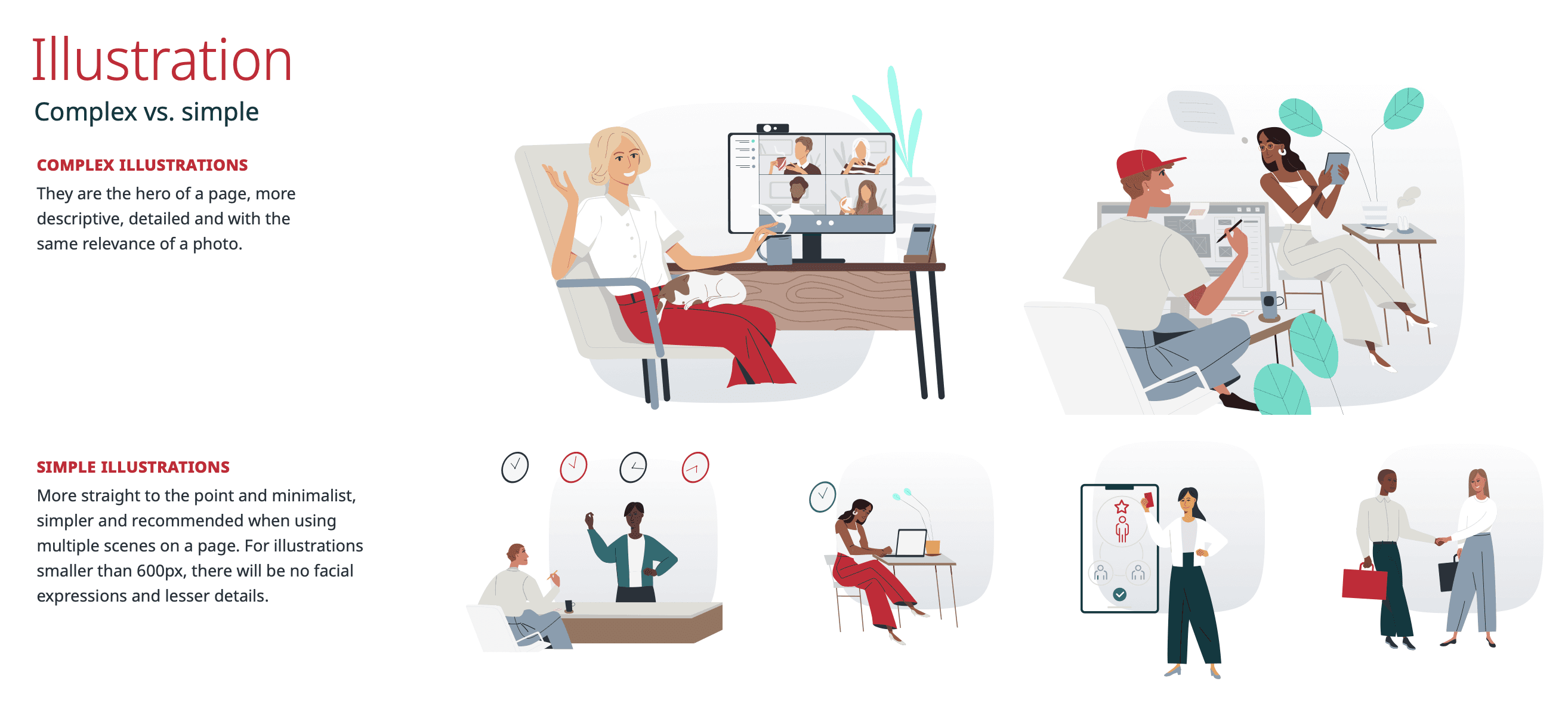
Build a visual world, not just a graphic style
A good illustration system has rules.
What kind of shapes does it use?
What kind of characters?
How much detail?
What colors?
What textures?
What visual metaphors keep showing up?
How does it handle motion?
How does it explain complex ideas?
This does not mean everything has to look rigid or over-designed. It means the brand has a recognizable world.
People should feel like the illustrations belong to the same family.
Not cousins who met once at a holiday party.
Connect the style to the brand personality
The illustration style has to match the brand’s actual voice.
If the brand is bold and rebellious, the visuals should not whisper politely from the corner. If the brand is calm and trustworthy, the visuals should not feel like a sugar-powered mascot escaped from a children’s app.
The goal is alignment.
A strong illustration system should feel like the brand learned how to draw.
Use illustration to clarify, not just decorate
The best brand illustrations do something.
They explain a concept. They guide attention. They create emotion. They show a before and after. They help a user understand where they are or what to do next.
Decoration is fine in small doses, but if every image exists only to “make the page less empty,” the system is not working hard enough.
And frankly, neither is the page.
Create recurring visual cues
Memorability comes from repetition with variation.
Recurring shapes, characters, objects, textures or visual metaphors help people connect one touchpoint to another. This is how a brand starts to feel familiar without becoming boring.
Think of it like a visual accent.
People should be able to recognize the brand’s presence even when the logo is not screaming for attention.
Keep it flexible
A useful illustration system should work across the real places a brand needs to show up.
Website hero images. Article graphics. Social posts. Sales decks. Product onboarding. Event visuals. Email headers. Internal tools. Campaigns.
If the style only works in one perfect layout under ideal lighting with everyone holding their breath, it is not a system.
It is a fragile little art project.
Make it flexible enough to grow.
Final thoughts
Custom illustration makes brands more memorable because it gives them something most brands are missing: a visual point of view.
It helps people recognize you faster, understand abstract ideas more easily and feel like they’ve stepped into a world that belongs to your brand.
If you’re going through a rebrand and don’t want to come out looking like everyone else with a slightly different color palette, consider custom illustration.
At Internauts, this is the kind of work we love: building brands with personality, clarity and enough visual edge to stay in people’s heads after they close the tab.
If this is something you would like to explore more give us a shout here.
Most brands are becoming visually forgettable
A lot of modern brands look good.
Clean layout. Nice typography. Friendly colors. Maybe a tasteful gradient floating somewhere in the background, minding its little gradient business.
But looking good is not the same as being memorable.
That’s the trap.
When brands use the same visual ingredients, they start creating the same emotional experience. The website might feel professional, but it does not feel specific. The social posts might look polished, but they do not feel ownable. The pitch deck might look “startup clean,” but ten minutes later nobody remembers who it belonged to.
This is not because the brand has nothing to say.
It is usually because the visual system is doing the bare minimum.
A logo cannot carry an entire brand by itself. A color palette cannot do all the emotional labor. Typography helps, but even great type needs a world around it.
Custom illustration gives that world shape.
It helps a brand say, “This is how we see things. This is how we explain things. This is the kind of experience you are stepping into.”
And people remember worlds faster than they remember assets.
What’s causing the sameness?
The cause is not mysterious.
Generic visuals are easy.
Stock photography is easy. Templates are easy. Icon packs are easy. Abstract 3D blobs are easy. AI-generated decorative visuals are now easy too, which means we are about to see a lot of shiny sameness pretending to be originality.
The problem is not that these tools exist. The problem is when brands use them as a substitute for having a point of view.
Most teams choose generic visuals because they are fast, affordable and safe to approve. Nobody gets in trouble for using a smiling team photo or a clean illustration of a person holding a giant phone. It checks the box. It fills the space. It says, “Look, design happened.”
But design did not really happen.
Decoration happened.
A memorable brand needs more than visual filler. It needs a visual language that connects to its personality, audience and message.
That is where custom illustration earns its keep.
It can turn complex ideas into simple visual metaphors. It can make serious topics feel more human. It can make a product experience feel friendlier. It can create continuity across a website, deck, campaign, onboarding flow or social post.
Most importantly, it helps people recognize the brand without needing the logo to explain who showed up.
That is the magic trick. Except it is not magic. It is strategy with a pencil.
Custom illustrations make abstract ideas easier to understand
Some brand ideas are hard to photograph.
How do you photograph trust? Or belonging? Or momentum? Or transformation? Or “we help your team stop fighting the website and start making better decisions”?
Good luck staging that with a conference room and a fake plant.
Custom illustration gives brands a way to visualize the invisible.
It can turn a complicated service into a simple story. It can show movement, friction, clarity, confusion, confidence or progress. It can explain the emotional benefit behind the product, not just the product itself.
That matters because people do not remember every line of copy. They remember the feeling the page gave them. They remember the character, the metaphor, the strange little moment that made the idea click.
A good illustration can become a shortcut for understanding.
Instead of forcing people to process another paragraph, it gives them a visual handle.
And when a brand creates enough of those handles, people start recognizing the system.
Custom illustration gives your brand a personality people can feel
A brand voice tells people how you sound.
Illustration shows people how you behave.
Are you playful? Precise? Warm? Weird? Elegant? Bold? Rebellious? Soft? Technical but human? Serious but not dead inside?
Your illustration style can carry all of that.
Line weight, color, composition, characters, texture, motion and visual metaphors all send signals. A rounded, soft illustration system feels different from a sharp, angular one. A hand-drawn style feels different from a polished editorial style.
A surreal world feels different from a literal product diagram.
None of these are random choices.
They shape how people interpret the brand before they consciously understand why.
That is why custom illustration should not be treated like a pretty add-on at the end of a project. It should be part of the brand system from the beginning.
Because once the visual world is defined, every touchpoint gets stronger.
The website feels more ownable. The deck feels less generic. The social content becomes easier to spot. The product experience feels more considered. Even small moments, like onboarding graphics or empty states, can carry the same personality.
That consistency builds familiarity.
Familiarity builds memory.
Memory builds trust.
Tiny chain. Big consequences.
How to use custom illustrations well
Custom illustration works best when it is treated as a system, not a pile of cute drawings.
A few strong illustrations can help, but the real value comes when the style becomes repeatable. The brand should be able to use it across different formats without everything falling apart like a chair from a suspicious online marketplace.
Here is where to start.
Build a visual world, not just a graphic style
A good illustration system has rules.
What kind of shapes does it use?
What kind of characters?
How much detail?
What colors?
What textures?
What visual metaphors keep showing up?
How does it handle motion?
How does it explain complex ideas?
This does not mean everything has to look rigid or over-designed. It means the brand has a recognizable world.
People should feel like the illustrations belong to the same family.
Not cousins who met once at a holiday party.
Connect the style to the brand personality
The illustration style has to match the brand’s actual voice.
If the brand is bold and rebellious, the visuals should not whisper politely from the corner. If the brand is calm and trustworthy, the visuals should not feel like a sugar-powered mascot escaped from a children’s app.
The goal is alignment.
A strong illustration system should feel like the brand learned how to draw.
Use illustration to clarify, not just decorate
The best brand illustrations do something.
They explain a concept. They guide attention. They create emotion. They show a before and after. They help a user understand where they are or what to do next.
Decoration is fine in small doses, but if every image exists only to “make the page less empty,” the system is not working hard enough.
And frankly, neither is the page.
Create recurring visual cues
Memorability comes from repetition with variation.
Recurring shapes, characters, objects, textures or visual metaphors help people connect one touchpoint to another. This is how a brand starts to feel familiar without becoming boring.
Think of it like a visual accent.
People should be able to recognize the brand’s presence even when the logo is not screaming for attention.
Keep it flexible
A useful illustration system should work across the real places a brand needs to show up.
Website hero images. Article graphics. Social posts. Sales decks. Product onboarding. Event visuals. Email headers. Internal tools. Campaigns.
If the style only works in one perfect layout under ideal lighting with everyone holding their breath, it is not a system.
It is a fragile little art project.
Make it flexible enough to grow.
Final thoughts
Custom illustration makes brands more memorable because it gives them something most brands are missing: a visual point of view.
It helps people recognize you faster, understand abstract ideas more easily and feel like they’ve stepped into a world that belongs to your brand.
If you’re going through a rebrand and don’t want to come out looking like everyone else with a slightly different color palette, consider custom illustration.
At Internauts, this is the kind of work we love: building brands with personality, clarity and enough visual edge to stay in people’s heads after they close the tab.
If this is something you would like to explore more give us a shout here.

Discover more about high-performance web design. Follow us on LinkedIn and Instagram.