
Cognitive Friction Is the Tax Bad Design Makes People Pay
Bad design does not just confuse people. It charges them mental rent until they leave.

F.J. Abrahams
Founder & Principal Internauts
Cognitive Friction Is the Tax Bad Design Makes People Pay
Bad design does not just confuse people. It charges them mental rent until they leave.
F.J. Abrahams
Founder & Principal Internauts
Cognitive friction is the hidden effort people spend trying to understand, trust, and use a digital experience. Some friction protects people. Too much friction quietly kills trust, action, adoption, and conversion.
Most digital experiences do not fail because people are lazy.
They fail because the experience makes people work too hard before anything useful happens.
A visitor lands on your website. They are curious. Maybe interested. Maybe ready to buy, apply, register, subscribe, donate, book, learn, or finally solve the thing that brought them there.
Then the tax begins.
A headline that sounds impressive but says nothing. A navigation menu built around internal departments. A button that looks like decoration. A form that asks for commitment before earning trust. A pricing page that hides the actual decision. A service page that needs a translator, a sandwich, and emotional support.
None of it looks catastrophic.
That is the problem.
Cognitive friction rarely walks in yelling. It leaks into the experience quietly. One unclear label. One buried next step. One overloaded section. One moment where the user has to stop and think, Wait, what am I supposed to do now?
And then they leave.
Not with a dramatic exit. No broken glass. No angry email. Just gone.
At Internauts, we define cognitive friction as the avoidable mental effort created when a digital experience makes people work harder than necessary to understand, trust, decide, or act.
The keyword is avoidable.
Not all effort is bad. Thinking is not the enemy. Complexity is not the enemy either. Don Norman has spent decades reminding designers that people need systems they can understand, act on, and recover from when something goes wrong. His work in The Design of Everyday Things is still painfully relevant because most digital products keep making the same old mistake: they blame the user when the system fails to communicate.
The problem is not that people do not understand your website.
The problem is that your website may not be doing enough to deserve understanding.
What Cognitive Friction Actually Is
Cognitive friction is the drag between intent and action.
It is the space between I need this and why is this making me fight for it?
In UX terms, this connects to cognitive load, the amount of mental processing required to use a site, product, form, or system. Nielsen Norman Group has written for years about the damage caused when interfaces demand too much mental effort. Cognitive Load Theory, especially the work of John Sweller, gives us another useful lens: some tasks are naturally complex, but bad presentation makes them harder for no good reason.
That “no good reason” part is where the trouble starts.
Because a lot of digital experiences ask people to do unpaid strategy work.
They have to decode the offer. Guess what the labels mean. Remember what they saw three screens ago. Translate internal language into human language. Decide whether the next step is useful, safe, relevant, or just another trap in a button costume.
That is not engagement.
That is labor.
And users did not clock in.
The Problem Is Not Friction. The Problem Is Dumb Friction.
This is where teams get sloppy.
They hear “reduce friction” and assume the goal is to make everything instant, effortless, and frictionless.
Nope.
Some friction is useful. A confirmation before deleting an account is good friction. A review screen before submitting a legal form is good friction. A warning before sharing sensitive information is good friction. A comparison table that slows someone down enough to choose the right plan is good friction.
Good friction protects people.
Bad friction protects the organization from making clearer decisions.
That is the line.
A tax form is complex. A healthcare portal is complex. A college financial aid process is complex. A B2B software purchase is complex. A public service application is complex.
Fine.
But complexity does not give design permission to be rude.
The more complex the task, the better the manners need to be.
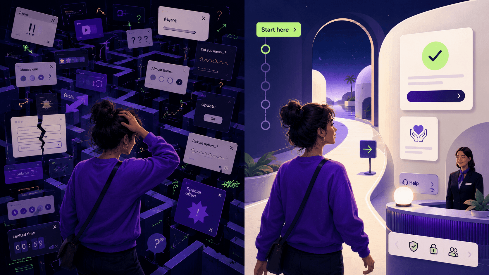
Where Cognitive Friction Shows Up
Cognitive friction is not one monster. It is a family of tiny goblins.
Sometimes it starts with the words.
Companies love to describe themselves from inside the building. Users arrive from outside the building. Different planet. Worse parking. That is how you get sentences like, “We deliver scalable transformation through integrated solutions.”
Beautiful. Somewhere, a consultant just shed a tear into a spreadsheet.
The user does not care about the company’s internal poetry. They want to know what this is, whether it is for them, whether it can help, why they should trust it, and what happens next. If the page answers those questions too late, too vaguely, or not at all, people do not “explore.” They bounce.
Sometimes the friction is visual.
The page looks clean, but everything important has the same volume. Cards compete. Buttons whisper. Decorative motion steals attention. Tiny type asks for patience nobody brought with them. Low contrast turns reading into an eye exam. Minimalism is especially guilty here because it often mistakes quiet for clear.
A clean interface can still be cognitively messy.
White space is not clarity. Muted colors are not strategy. A quiet room can still have terrible directions.
Sometimes the friction lives in the interaction itself.
A dropdown behaves like a link. A button opens a modal out of nowhere. A form clears after an error. A chatbot interrupts before it understands intent. A checkout hides costs until the last step because apparently trust is optional now.
This is where Norman’s principles around feedback, discoverability, constraints, and mapping still matter. People need to understand what actions are possible, what happened after they acted, and how to recover when something goes sideways.
That is not just usability.
That is basic digital decency.
Then there is decision friction, which may be the most common and least admitted.
This happens when the experience gives people options but does not help them choose. Pricing pages do this. Service pages do this. Product selectors do this. Application flows do this. AI tools are becoming spectacular at this. Fifteen shiny buttons, zero guidance. Congratulations, you built a cockpit for someone who asked for a bicycle.
The issue is not the number of choices. The issue is that every choice looks equally loud, equally vague, or equally risky.
People do not just need information. They need decision support. They need cues. They need comparison. They need plain labels. They need proof before commitment. They need the interface to stop acting like remembering everything is part of the user’s job description.
Nielsen Norman Group’s heuristic “recognition rather than recall” says this cleanly: do not make people remember everything. Help them recognize what matters when they need it.
In other words, stop making users carry your whole website in their head like a cursed grocery list.
And then there is emotional friction.
This is the one most teams miss because it does not always show up in analytics with a neat little label.
People do not arrive as neutral task machines. They arrive tired, distracted, curious, skeptical, overwhelmed, excited, embarrassed, in a hurry, on their phone, between meetings, at the DMV, or trying very hard not to throw the laptop into the sun.
Byron Reeves and Clifford Nass argued in The Media Equation that people respond to computers and media socially, often treating them like people or places. That matters because every digital experience has tone, behavior, timing, and manners, whether we design those things intentionally or not.
A confusing website can feel dismissive.
A cold form can feel suspicious.
A broken flow can feel like blame.
A helpful interface can feel like relief.
This is where Internauts’ idea of digital hospitality comes in.
Hospitality is not about being cute. It is about making people feel oriented, respected, and supported while they do the thing they came to do.
Good digital hospitality says: you are in the right place, here is what matters, here is what happens next, and if something goes wrong, we will not make you feel stupid for being human.
That is not soft.
That is strategy with a pulse.
Instructional Experiences Are Not Enough Anymore
Most websites are still instructional.
They tell people what to do. Click here. Submit this. Read more. Select one. Accept all cookies because the internet is apparently a hostage negotiation.
Instructional experiences tell people what to do.
Intentional experiences understand what people are trying to do.
That shift matters.
Instructional design makes the user adapt to the system. Intentional design makes the system respect the user’s context.
This does not mean creepy personalization. Nobody needs a website whispering, “Welcome back, Federico. We noticed you hesitated over the pricing page at 11:43 p.m.”
Calm down, Dracula.
Intentional interaction means the experience is designed around what someone likely needs in that moment. What do they already understand? What are they trying to decide? What might make them hesitate? What kind of proof do they need before trusting the next step? What can the interface handle instead of dumping the work back onto their brain?
That is the move.
From instructional to intentional.
From “Here are the steps” to “Here is the path.”
How Internauts Fixes Cognitive Friction
At Internauts, we do not treat cognitive friction like a surface problem.
We are not here to sprinkle white space on a broken experience and call it strategy.
We look at the behavior of the whole thing.
Where are people landing? What are they trying to do? Where do they slow down? Where do they lose trust? Where does the page ask for action before it earns confidence? Where does the company’s internal logic leak all over the user journey?
That is where Neurodigital Design becomes practical.
It is not a mood board. It is not inclusive design wearing a new hat. It is a way to design digital experiences around how people actually perceive, process, decide, hesitate, trust, and act.
We start with intent and adoption because conversion alone is a tiny, needy little metric if nobody comes back.
Intent is what the person came to do. Adoption is whether the experience makes that action worth repeating. Most teams obsess over conversion and ignore adoption, which is how you get funnels that squeeze people once and relationships that die immediately after.
A conversion can be forced.
Adoption has to be earned.
So we look at where the user’s goal and the organization’s goal align, where they collide, and what has to be understood before action feels safe. Sometimes that means restructuring navigation around real tasks instead of internal departments. Sometimes it means rewriting a page around the questions people actually have. Sometimes it means changing the sequence so confidence comes before commitment.
The goal is not more clicks.
The goal is less hesitation, better decisions, and stronger follow-through.
Designing for Human Context
Personas are useful until they become fake little cardboard humans with stock-photo smiles and suspiciously tidy motivations.
“Marketing Manager Maria” is not always the same person.
Sometimes Maria is focused. Sometimes she is fried. Sometimes she is comparing vendors between meetings while eating lunch over her keyboard like a raccoon with a calendar invite.
That is why we design for states, not just personas.
At Internauts, Human Context States help us understand what is really happening around the interaction. Not just who the person is on paper, but what kind of moment they are in.
Are they focused or fried? Curious or skeptical? Sitting at a desk with time to think, or standing in line trying to finish something on their phone before the screen times out? Are they calm enough to compare options, or do they need the next step to be obvious before frustration takes over?
These states help us read the room before we redesign the room.
They help us understand where people are, how they may feel, what kind of pressure they are under, how much attention they can realistically give, how much trust the experience has earned, and what kind of support would make the next action feel easier.
Same person.
Different state.
Different design responsibility.
Digital Hospitality Is Not Decoration
Digital hospitality is where the experience stops behaving like a machine with a checklist and starts behaving like someone who noticed you walked into the room.
It gives people orientation before it gives them options. It uses plain language without acting like the reader is five. It makes the next step visible before doubt has time to multiply. When something goes wrong, it does not punish the user for being human. It helps them recover.
The best digital experiences do this quietly. They guide attention without grabbing people by the collar. They offer proof when trust is needed. They hold back when the person is already overloaded. They understand that clarity is not the same as simplicity, and support is not the same as hand-holding.
Nielsen Norman Group recently put it plainly in its guidance on form design: “Forms are mental work.” That line should be taped to every product team’s wall, preferably next to the coffee machine where people make decisions they later regret.
And it is not just forms.
Websites are mental work. Product tours are mental work. Service portals are mental work. AI tools are mental work. Checkout flows are mental work. Public benefit applications are absolutely mental work.
Digital hospitality means we design like someone is actually on the other side.
Wild concept. Still underfunded.
What Better Digital Experiences Make Possible
Reducing cognitive friction changes how an experience feels before it changes any metric.
People understand where they are, what matters, and what will happen next. They can make decisions without decoding the interface or worrying that one wrong move will cost them.
The goal is not to remove every pause, question, or decision. Some friction protects people. Some helps them slow down and choose well. The problem is the unnecessary friction that creates doubt without adding value.
Better digital experiences replace that doubt with clarity, context, and consideration. They make the next step easier to understand, easier to trust, and less exhausting to take.
That is what we mean by digital hospitality.
The experience does not need to know everything about the person. It simply needs to behave as though someone is actually on the other side.
Cognitive Friction Is a Business Problem
The easiest way to underestimate cognitive friction is to call it a UX issue.
Too small.
Cognitive friction affects trust. Trust affects decisions. Decisions affect conversion. Conversion affects revenue. Revenue affects whether leadership suddenly discovers design strategy.
Funny how that works.
But this is bigger than commercial websites.
In public service, healthcare, education, finance, accessibility-critical systems, and AI products, cognitive friction can block access. It can make people abandon applications, misunderstand requirements, miss deadlines, submit the wrong information, lose confidence, or decide the system was never built for them.
Sometimes the user does not fail the task.
The task fails the user.
That is the part we care about.
Good design is not decoration after strategy.
Good design is how strategy survives contact with actual humans.
Final Thoughts
Cognitive friction is not the enemy.
Unnecessary cognitive friction is.
The future is not frictionless design. Frictionless can become careless. Sometimes people need a pause, a warning, a comparison, a review, a moment to understand the weight of a decision.
The real goal is better friction.
Friction with purpose. Friction that protects. Friction that clarifies. Friction that helps people make better decisions instead of punishing them for not already knowing what the system means.
That is the Internauts POV.
We design for brains, not just clicks.
And if your website makes people fight their way to understanding, the problem is not the user.
The problem is the manners of the machine.
If your website, product, form, or digital service is making people think too hard, we can help find the friction and fix the path.
Bring us the beautiful digital mess. We love those.
Most digital experiences do not fail because people are lazy.
They fail because the experience makes people work too hard before anything useful happens.
A visitor lands on your website. They are curious. Maybe interested. Maybe ready to buy, apply, register, subscribe, donate, book, learn, or finally solve the thing that brought them there.
Then the tax begins.
A headline that sounds impressive but says nothing. A navigation menu built around internal departments. A button that looks like decoration. A form that asks for commitment before earning trust. A pricing page that hides the actual decision. A service page that needs a translator, a sandwich, and emotional support.
None of it looks catastrophic.
That is the problem.
Cognitive friction rarely walks in yelling. It leaks into the experience quietly. One unclear label. One buried next step. One overloaded section. One moment where the user has to stop and think, Wait, what am I supposed to do now?
And then they leave.
Not with a dramatic exit. No broken glass. No angry email. Just gone.
At Internauts, we define cognitive friction as the avoidable mental effort created when a digital experience makes people work harder than necessary to understand, trust, decide, or act.
The keyword is avoidable.
Not all effort is bad. Thinking is not the enemy. Complexity is not the enemy either. Don Norman has spent decades reminding designers that people need systems they can understand, act on, and recover from when something goes wrong. His work in The Design of Everyday Things is still painfully relevant because most digital products keep making the same old mistake: they blame the user when the system fails to communicate.
The problem is not that people do not understand your website.
The problem is that your website may not be doing enough to deserve understanding.
What Cognitive Friction Actually Is
Cognitive friction is the drag between intent and action.
It is the space between I need this and why is this making me fight for it?
In UX terms, this connects to cognitive load, the amount of mental processing required to use a site, product, form, or system. Nielsen Norman Group has written for years about the damage caused when interfaces demand too much mental effort. Cognitive Load Theory, especially the work of John Sweller, gives us another useful lens: some tasks are naturally complex, but bad presentation makes them harder for no good reason.
That “no good reason” part is where the trouble starts.
Because a lot of digital experiences ask people to do unpaid strategy work.
They have to decode the offer. Guess what the labels mean. Remember what they saw three screens ago. Translate internal language into human language. Decide whether the next step is useful, safe, relevant, or just another trap in a button costume.
That is not engagement.
That is labor.
And users did not clock in.
The Problem Is Not Friction. The Problem Is Dumb Friction.
This is where teams get sloppy.
They hear “reduce friction” and assume the goal is to make everything instant, effortless, and frictionless.
Nope.
Some friction is useful. A confirmation before deleting an account is good friction. A review screen before submitting a legal form is good friction. A warning before sharing sensitive information is good friction. A comparison table that slows someone down enough to choose the right plan is good friction.
Good friction protects people.
Bad friction protects the organization from making clearer decisions.
That is the line.
A tax form is complex. A healthcare portal is complex. A college financial aid process is complex. A B2B software purchase is complex. A public service application is complex.
Fine.
But complexity does not give design permission to be rude.
The more complex the task, the better the manners need to be.
Where Cognitive Friction Shows Up
Cognitive friction is not one monster. It is a family of tiny goblins.
Sometimes it starts with the words.
Companies love to describe themselves from inside the building. Users arrive from outside the building. Different planet. Worse parking. That is how you get sentences like, “We deliver scalable transformation through integrated solutions.”
Beautiful. Somewhere, a consultant just shed a tear into a spreadsheet.
The user does not care about the company’s internal poetry. They want to know what this is, whether it is for them, whether it can help, why they should trust it, and what happens next. If the page answers those questions too late, too vaguely, or not at all, people do not “explore.” They bounce.
Sometimes the friction is visual.
The page looks clean, but everything important has the same volume. Cards compete. Buttons whisper. Decorative motion steals attention. Tiny type asks for patience nobody brought with them. Low contrast turns reading into an eye exam. Minimalism is especially guilty here because it often mistakes quiet for clear.
A clean interface can still be cognitively messy.
White space is not clarity. Muted colors are not strategy. A quiet room can still have terrible directions.
Sometimes the friction lives in the interaction itself.
A dropdown behaves like a link. A button opens a modal out of nowhere. A form clears after an error. A chatbot interrupts before it understands intent. A checkout hides costs until the last step because apparently trust is optional now.
This is where Norman’s principles around feedback, discoverability, constraints, and mapping still matter. People need to understand what actions are possible, what happened after they acted, and how to recover when something goes sideways.
That is not just usability.
That is basic digital decency.
Then there is decision friction, which may be the most common and least admitted.
This happens when the experience gives people options but does not help them choose. Pricing pages do this. Service pages do this. Product selectors do this. Application flows do this. AI tools are becoming spectacular at this. Fifteen shiny buttons, zero guidance. Congratulations, you built a cockpit for someone who asked for a bicycle.
The issue is not the number of choices. The issue is that every choice looks equally loud, equally vague, or equally risky.
People do not just need information. They need decision support. They need cues. They need comparison. They need plain labels. They need proof before commitment. They need the interface to stop acting like remembering everything is part of the user’s job description.
Nielsen Norman Group’s heuristic “recognition rather than recall” says this cleanly: do not make people remember everything. Help them recognize what matters when they need it.
In other words, stop making users carry your whole website in their head like a cursed grocery list.
And then there is emotional friction.
This is the one most teams miss because it does not always show up in analytics with a neat little label.
People do not arrive as neutral task machines. They arrive tired, distracted, curious, skeptical, overwhelmed, excited, embarrassed, in a hurry, on their phone, between meetings, at the DMV, or trying very hard not to throw the laptop into the sun.
Byron Reeves and Clifford Nass argued in The Media Equation that people respond to computers and media socially, often treating them like people or places. That matters because every digital experience has tone, behavior, timing, and manners, whether we design those things intentionally or not.
A confusing website can feel dismissive.
A cold form can feel suspicious.
A broken flow can feel like blame.
A helpful interface can feel like relief.
This is where Internauts’ idea of digital hospitality comes in.
Hospitality is not about being cute. It is about making people feel oriented, respected, and supported while they do the thing they came to do.
Good digital hospitality says: you are in the right place, here is what matters, here is what happens next, and if something goes wrong, we will not make you feel stupid for being human.
That is not soft.
That is strategy with a pulse.
Instructional Experiences Are Not Enough Anymore
Most websites are still instructional.
They tell people what to do. Click here. Submit this. Read more. Select one. Accept all cookies because the internet is apparently a hostage negotiation.
Instructional experiences tell people what to do.
Intentional experiences understand what people are trying to do.
That shift matters.
Instructional design makes the user adapt to the system. Intentional design makes the system respect the user’s context.
This does not mean creepy personalization. Nobody needs a website whispering, “Welcome back, Federico. We noticed you hesitated over the pricing page at 11:43 p.m.”
Calm down, Dracula.
Intentional interaction means the experience is designed around what someone likely needs in that moment. What do they already understand? What are they trying to decide? What might make them hesitate? What kind of proof do they need before trusting the next step? What can the interface handle instead of dumping the work back onto their brain?
That is the move.
From instructional to intentional.
From “Here are the steps” to “Here is the path.”
How Internauts Fixes Cognitive Friction
At Internauts, we do not treat cognitive friction like a surface problem.
We are not here to sprinkle white space on a broken experience and call it strategy.
We look at the behavior of the whole thing.
Where are people landing? What are they trying to do? Where do they slow down? Where do they lose trust? Where does the page ask for action before it earns confidence? Where does the company’s internal logic leak all over the user journey?
That is where Neurodigital Design becomes practical.
It is not a mood board. It is not inclusive design wearing a new hat. It is a way to design digital experiences around how people actually perceive, process, decide, hesitate, trust, and act.
We start with intent and adoption because conversion alone is a tiny, needy little metric if nobody comes back.
Intent is what the person came to do. Adoption is whether the experience makes that action worth repeating. Most teams obsess over conversion and ignore adoption, which is how you get funnels that squeeze people once and relationships that die immediately after.
A conversion can be forced.
Adoption has to be earned.
So we look at where the user’s goal and the organization’s goal align, where they collide, and what has to be understood before action feels safe. Sometimes that means restructuring navigation around real tasks instead of internal departments. Sometimes it means rewriting a page around the questions people actually have. Sometimes it means changing the sequence so confidence comes before commitment.
The goal is not more clicks.
The goal is less hesitation, better decisions, and stronger follow-through.
Designing for Human Context
Personas are useful until they become fake little cardboard humans with stock-photo smiles and suspiciously tidy motivations.
“Marketing Manager Maria” is not always the same person.
Sometimes Maria is focused. Sometimes she is fried. Sometimes she is comparing vendors between meetings while eating lunch over her keyboard like a raccoon with a calendar invite.
That is why we design for states, not just personas.
At Internauts, Human Context States help us understand what is really happening around the interaction. Not just who the person is on paper, but what kind of moment they are in.
Are they focused or fried? Curious or skeptical? Sitting at a desk with time to think, or standing in line trying to finish something on their phone before the screen times out? Are they calm enough to compare options, or do they need the next step to be obvious before frustration takes over?
These states help us read the room before we redesign the room.
They help us understand where people are, how they may feel, what kind of pressure they are under, how much attention they can realistically give, how much trust the experience has earned, and what kind of support would make the next action feel easier.
Same person.
Different state.
Different design responsibility.
Digital Hospitality Is Not Decoration
Digital hospitality is where the experience stops behaving like a machine with a checklist and starts behaving like someone who noticed you walked into the room.
It gives people orientation before it gives them options. It uses plain language without acting like the reader is five. It makes the next step visible before doubt has time to multiply. When something goes wrong, it does not punish the user for being human. It helps them recover.
The best digital experiences do this quietly. They guide attention without grabbing people by the collar. They offer proof when trust is needed. They hold back when the person is already overloaded. They understand that clarity is not the same as simplicity, and support is not the same as hand-holding.
Nielsen Norman Group recently put it plainly in its guidance on form design: “Forms are mental work.” That line should be taped to every product team’s wall, preferably next to the coffee machine where people make decisions they later regret.
And it is not just forms.
Websites are mental work. Product tours are mental work. Service portals are mental work. AI tools are mental work. Checkout flows are mental work. Public benefit applications are absolutely mental work.
Digital hospitality means we design like someone is actually on the other side.
Wild concept. Still underfunded.
What Better Digital Experiences Make Possible
Reducing cognitive friction changes how an experience feels before it changes any metric.
People understand where they are, what matters, and what will happen next. They can make decisions without decoding the interface or worrying that one wrong move will cost them.
The goal is not to remove every pause, question, or decision. Some friction protects people. Some helps them slow down and choose well. The problem is the unnecessary friction that creates doubt without adding value.
Better digital experiences replace that doubt with clarity, context, and consideration. They make the next step easier to understand, easier to trust, and less exhausting to take.
That is what we mean by digital hospitality.
The experience does not need to know everything about the person. It simply needs to behave as though someone is actually on the other side.
Cognitive Friction Is a Business Problem
The easiest way to underestimate cognitive friction is to call it a UX issue.
Too small.
Cognitive friction affects trust. Trust affects decisions. Decisions affect conversion. Conversion affects revenue. Revenue affects whether leadership suddenly discovers design strategy.
Funny how that works.
But this is bigger than commercial websites.
In public service, healthcare, education, finance, accessibility-critical systems, and AI products, cognitive friction can block access. It can make people abandon applications, misunderstand requirements, miss deadlines, submit the wrong information, lose confidence, or decide the system was never built for them.
Sometimes the user does not fail the task.
The task fails the user.
That is the part we care about.
Good design is not decoration after strategy.
Good design is how strategy survives contact with actual humans.
Final Thoughts
Cognitive friction is not the enemy.
Unnecessary cognitive friction is.
The future is not frictionless design. Frictionless can become careless. Sometimes people need a pause, a warning, a comparison, a review, a moment to understand the weight of a decision.
The real goal is better friction.
Friction with purpose. Friction that protects. Friction that clarifies. Friction that helps people make better decisions instead of punishing them for not already knowing what the system means.
That is the Internauts POV.
We design for brains, not just clicks.
And if your website makes people fight their way to understanding, the problem is not the user.
The problem is the manners of the machine.
If your website, product, form, or digital service is making people think too hard, we can help find the friction and fix the path.
Bring us the beautiful digital mess. We love those.


Discover more about high-performance web design. Follow us on LinkedIn and Instagram.