
Visual Hierarchy Examples That Help People Know What to Do Next
Good hierarchy helps people understand what matters first, what supports it, and what to do next.

Internauts Editorial
Client Success. When we are not crafting, we write.
Visual Hierarchy Examples That Help People Know What to Do Next
Good hierarchy helps people understand what matters first, what supports it, and what to do next.
Internauts Editorial
Client Success. When we are not crafting, we write.
A page can have the right content and still feel hard to use. Visual hierarchy uses scale, spacing, grouping and contrast to guide attention, reduce hesitation, and help people move from promise to proof to action.
Visual hierarchy is not decoration. It is the architecture of attention.
Most weak websites do not fail because they lack information.
They fail because the information arrives in the wrong order.
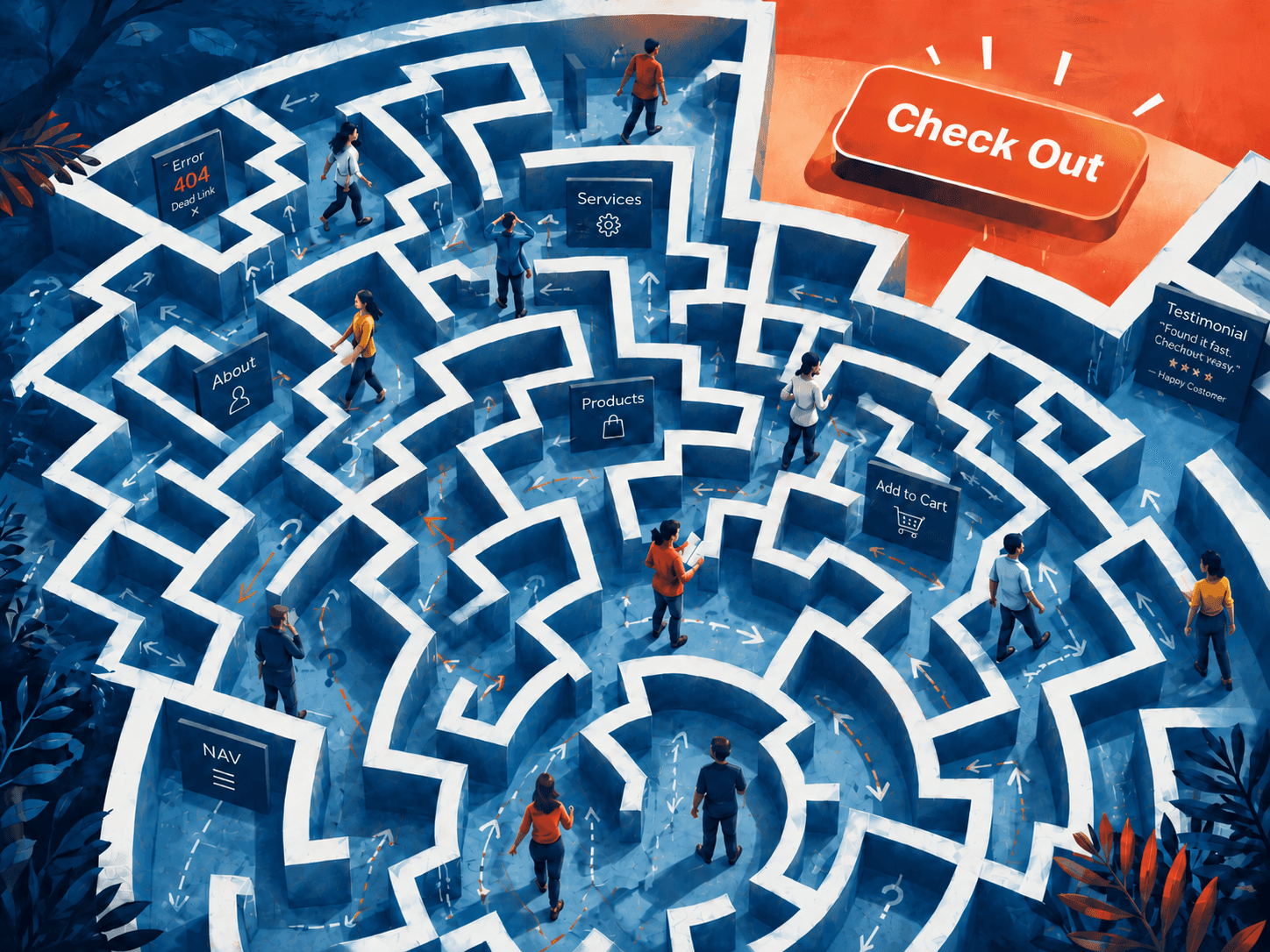
The headline competes with the image. The button competes with the badge. The testimonial sits nearby like a decorative throw pillow. The user scans, pauses, compares, hesitates and then quietly leaves.
That is not only a content problem. It is a hierarchy problem.
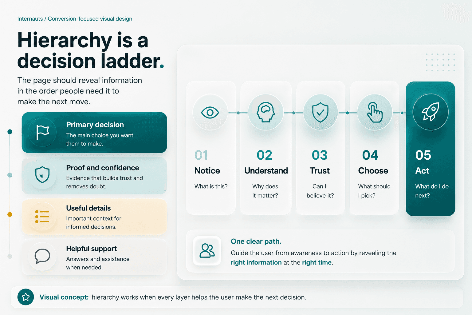
Visual hierarchy is the system that tells people what to notice first, what to understand next, what to trust and what to do when they are ready. Scale, grouping, spacing and contrast are not just aesthetic choices. They are instructions for attention.
A good page does not make people work to find the next step. It reveals the right information at the right moment.
Why weak hierarchy creates friction
Weak hierarchy usually happens when every part of the page is treated like it deserves equal attention.
The logo wants attention. The navigation wants attention. The hero image wants attention. The announcement bar wants attention. The secondary button wants attention. The tiny badge claiming “award-winning something” also wants attention, because apparently everyone gets a microphone now.
The result is not clarity. It is noise.
People do not read websites in a perfect, patient order. They scan. They compare. They decide whether the page feels worth the effort. When the visual order is unclear, users have to build the meaning themselves.
That creates cognitive friction.
Instead of asking, “Is this right for me?” they are stuck asking, “What am I supposed to look at?”
That moment matters. Confusion rarely announces itself. It shows up as hesitation, wandering scrolls, wrong clicks, abandoned forms or the quiet little tragedy of a closed tab.
Example 1: The hero section
The hero section has one brutal job: make the offer understandable before the user starts wandering.
A strong hero usually answers four questions:
What is this?
Why should I care?
Can I trust it?
What should I do next?
Many websites break this immediately. The logo, navigation, announcement bar, eyebrow text, headline, subhead, image, badge, primary button and secondary button all show up demanding attention like they paid rent.
They did not.
A better hierarchy chooses the one thing the visitor must understand first. For a design studio, that might be the outcome: Design against cognitive friction. The supporting line explains what that means. Proof sits close enough to reduce doubt. The primary action is visually stronger than every secondary path.
The point is not to make the hero smaller. The point is to make the decision clearer.
Example 2: The service section
Service sections often become tidy little grids where everything looks equally important.
That may look balanced, but it can hide the strategy.
If one service is the main offer, one is a supporting service and one is an add-on, they should not all have the same visual weight. Equal layout can accidentally tell the user, “These all matter the same,” even when they do not.
A better service section uses hierarchy to show the buying path.
The primary offer can have a larger card, stronger headline, deeper explanation and clearer call to action. Supporting services can use shorter cards or lighter treatments. The layout starts to explain the relationship between services before the user has to work too hard.
That is the point. Good hierarchy quietly answers questions before they become friction.
Example 3: The testimonial
Testimonials are often treated like decorative proof.
They get dropped onto the page because someone said, “We need social proof,” and then everyone moved on with their lives.
But a testimonial is strongest when it supports a specific claim.
If a section says the redesign made the site easier to understand, the testimonial should reinforce clarity, confidence, speed, fewer customer questions or better decision-making. Otherwise, it is just praise floating in space.
The hierarchy matters too. Pull out the strongest phrase. Keep the client name and role close to the quote. Avoid burying the useful sentence inside a long paragraph where only the brave and caffeinated will find it.
The best testimonial does not just say, “They were great.”
It helps the next buyer believe the promise.
Example 4: The pricing or package area
Pricing pages are decision environments.
People are comparing value, risk, timing, trust and fit. If every feature receives the same visual weight, the user has to build the comparison model in their head.
That is a lot to ask from someone who may already be skeptical, busy, distracted or secretly checking the page between meetings.
Better hierarchy groups related features, highlights meaningful differences and separates decision-critical details from supporting details.
That does not mean forcing a fake “most popular” badge onto the middle plan because SaaS apparently made that a constitutional requirement.
It means helping the buyer understand which choice fits which situation.
The easier the comparison, the lower the hesitation.
How to improve visual hierarchy
Start with the decision, not the layout.
Before moving pixels around, ask what the user needs to understand first. Then ask what proof they need, what details help and what action belongs to the moment.
Use scale to show importance. Bigger should mean more important, not just louder.
Use contrast to separate the key message and key action from everything around them. If every element is bold, nothing is bold. That is not design. That is a visual group chat.
Use grouping to show what belongs together. Related ideas should feel related. Buttons should sit near the message they support. Proof should appear close to the claim it strengthens.
Use sequence to arrange information in the order people need it. The page should move from promise to proof to action, not from random thought to random thought with a button hiding somewhere near the footer.
And use space like it matters, because it does. Whitespace is not empty. It gives the brain room to sort what matters.
A useful test
Blur the page or step back from the screen.
If the most important message and action disappear, the hierarchy is too weak.
If too many elements still shout, the hierarchy is too noisy.
A good page has one dominant read, a few supporting reads and a calm background. It should be possible to understand the main path before reading every word.
That does not mean the details are unimportant. It means they should arrive when they are useful.
Final thoughts
Visual hierarchy helps users decide because it turns attention into a guided path.
That does not mean manipulating people into clicking. It means respecting the fact that people arrive with limited time, limited patience and a brain already doing twelve other things.
A good page knows what matters first. It knows what needs proof. It knows when details help and when they get in the way.
Hierarchy works when every layer helps the user make the next decision.
Visual hierarchy is not decoration. It is the architecture of attention.
Most weak websites do not fail because they lack information.
They fail because the information arrives in the wrong order.
The headline competes with the image. The button competes with the badge. The testimonial sits nearby like a decorative throw pillow. The user scans, pauses, compares, hesitates and then quietly leaves.
That is not only a content problem. It is a hierarchy problem.
Visual hierarchy is the system that tells people what to notice first, what to understand next, what to trust and what to do when they are ready. Scale, grouping, spacing and contrast are not just aesthetic choices. They are instructions for attention.
A good page does not make people work to find the next step. It reveals the right information at the right moment.
Why weak hierarchy creates friction
Weak hierarchy usually happens when every part of the page is treated like it deserves equal attention.
The logo wants attention. The navigation wants attention. The hero image wants attention. The announcement bar wants attention. The secondary button wants attention. The tiny badge claiming “award-winning something” also wants attention, because apparently everyone gets a microphone now.
The result is not clarity. It is noise.
People do not read websites in a perfect, patient order. They scan. They compare. They decide whether the page feels worth the effort. When the visual order is unclear, users have to build the meaning themselves.
That creates cognitive friction.
Instead of asking, “Is this right for me?” they are stuck asking, “What am I supposed to look at?”
That moment matters. Confusion rarely announces itself. It shows up as hesitation, wandering scrolls, wrong clicks, abandoned forms or the quiet little tragedy of a closed tab.
Example 1: The hero section
The hero section has one brutal job: make the offer understandable before the user starts wandering.
A strong hero usually answers four questions:
What is this?
Why should I care?
Can I trust it?
What should I do next?
Many websites break this immediately. The logo, navigation, announcement bar, eyebrow text, headline, subhead, image, badge, primary button and secondary button all show up demanding attention like they paid rent.
They did not.
A better hierarchy chooses the one thing the visitor must understand first. For a design studio, that might be the outcome: Design against cognitive friction. The supporting line explains what that means. Proof sits close enough to reduce doubt. The primary action is visually stronger than every secondary path.
The point is not to make the hero smaller. The point is to make the decision clearer.
Example 2: The service section
Service sections often become tidy little grids where everything looks equally important.
That may look balanced, but it can hide the strategy.
If one service is the main offer, one is a supporting service and one is an add-on, they should not all have the same visual weight. Equal layout can accidentally tell the user, “These all matter the same,” even when they do not.
A better service section uses hierarchy to show the buying path.
The primary offer can have a larger card, stronger headline, deeper explanation and clearer call to action. Supporting services can use shorter cards or lighter treatments. The layout starts to explain the relationship between services before the user has to work too hard.
That is the point. Good hierarchy quietly answers questions before they become friction.
Example 3: The testimonial
Testimonials are often treated like decorative proof.
They get dropped onto the page because someone said, “We need social proof,” and then everyone moved on with their lives.
But a testimonial is strongest when it supports a specific claim.
If a section says the redesign made the site easier to understand, the testimonial should reinforce clarity, confidence, speed, fewer customer questions or better decision-making. Otherwise, it is just praise floating in space.
The hierarchy matters too. Pull out the strongest phrase. Keep the client name and role close to the quote. Avoid burying the useful sentence inside a long paragraph where only the brave and caffeinated will find it.
The best testimonial does not just say, “They were great.”
It helps the next buyer believe the promise.
Example 4: The pricing or package area
Pricing pages are decision environments.
People are comparing value, risk, timing, trust and fit. If every feature receives the same visual weight, the user has to build the comparison model in their head.
That is a lot to ask from someone who may already be skeptical, busy, distracted or secretly checking the page between meetings.
Better hierarchy groups related features, highlights meaningful differences and separates decision-critical details from supporting details.
That does not mean forcing a fake “most popular” badge onto the middle plan because SaaS apparently made that a constitutional requirement.
It means helping the buyer understand which choice fits which situation.
The easier the comparison, the lower the hesitation.
How to improve visual hierarchy
Start with the decision, not the layout.
Before moving pixels around, ask what the user needs to understand first. Then ask what proof they need, what details help and what action belongs to the moment.
Use scale to show importance. Bigger should mean more important, not just louder.
Use contrast to separate the key message and key action from everything around them. If every element is bold, nothing is bold. That is not design. That is a visual group chat.
Use grouping to show what belongs together. Related ideas should feel related. Buttons should sit near the message they support. Proof should appear close to the claim it strengthens.
Use sequence to arrange information in the order people need it. The page should move from promise to proof to action, not from random thought to random thought with a button hiding somewhere near the footer.
And use space like it matters, because it does. Whitespace is not empty. It gives the brain room to sort what matters.
A useful test
Blur the page or step back from the screen.
If the most important message and action disappear, the hierarchy is too weak.
If too many elements still shout, the hierarchy is too noisy.
A good page has one dominant read, a few supporting reads and a calm background. It should be possible to understand the main path before reading every word.
That does not mean the details are unimportant. It means they should arrive when they are useful.
Final thoughts
Visual hierarchy helps users decide because it turns attention into a guided path.
That does not mean manipulating people into clicking. It means respecting the fact that people arrive with limited time, limited patience and a brain already doing twelve other things.
A good page knows what matters first. It knows what needs proof. It knows when details help and when they get in the way.
Hierarchy works when every layer helps the user make the next decision.

Discover more about high-performance web design. Follow us on LinkedIn and Instagram.