Conversion Design Is Not Just Button Color
Button color gets attention. Real conversion design starts before the click, with trust, context and a clear next step.

Internauts Editorial
Client Success. When we are not crafting, we write.
Conversion Design Is Not Just Button Color
Button color gets attention. Real conversion design starts before the click, with trust, context and a clear next step.
Internauts Editorial
Client Success. When we are not crafting, we write.
Button color is easy to test and easier to overrate. The real question is not whether your CTA is orange, green, blue, or wearing a tiny conversion cape. The real question is whether the page has earned the click before the button asks for it.
Button color is one of the easiest conversion conversations to have because it feels concrete. Orange feels urgent. Green feels friendly. Blue feels safe. Bigger feels bolder. Higher on the page feels more important.
Those changes can matter. A button should be visible, readable and hard to miss. It should not hide like it owes the user money.
But button color rarely fixes the real problem.
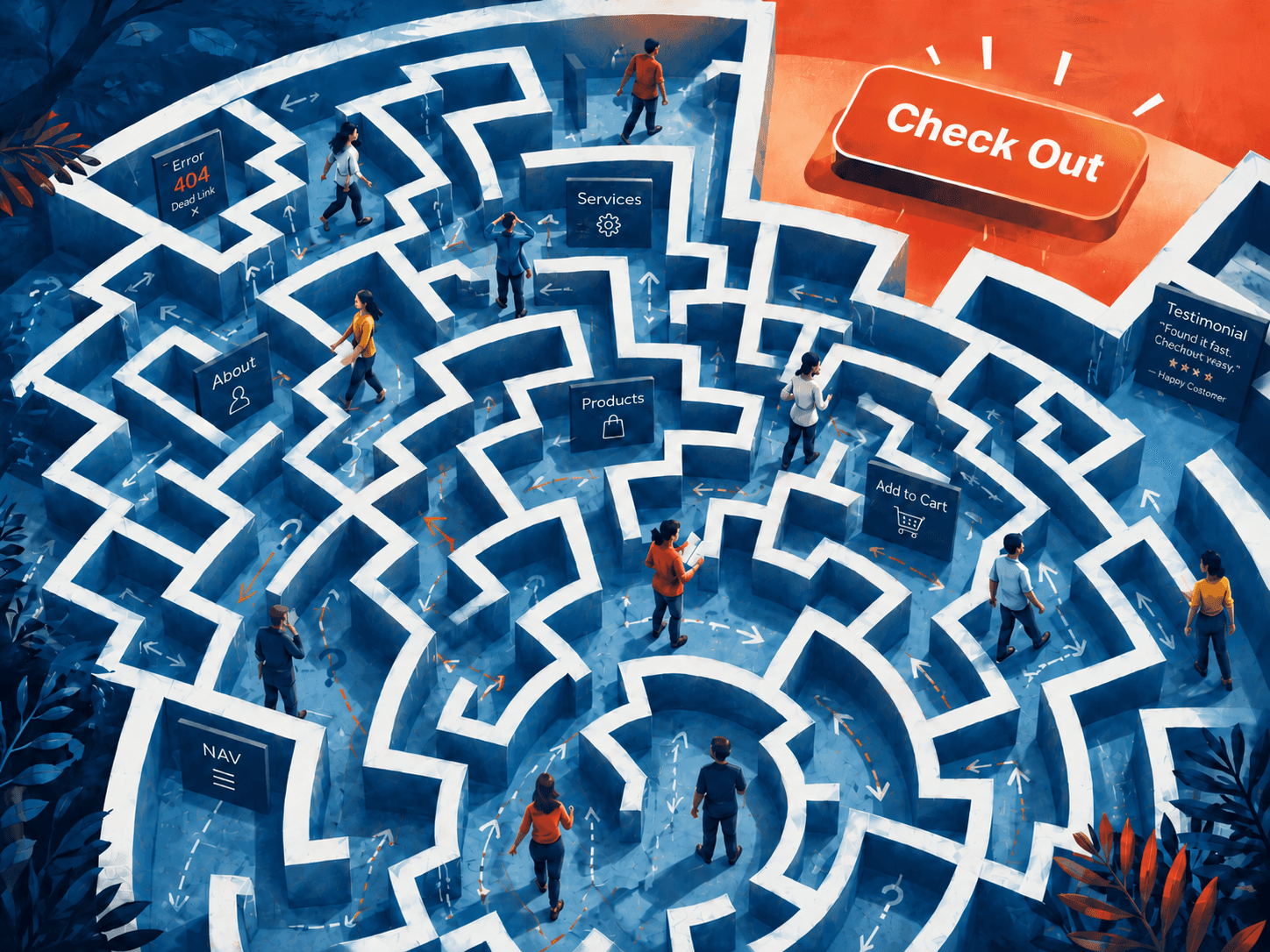
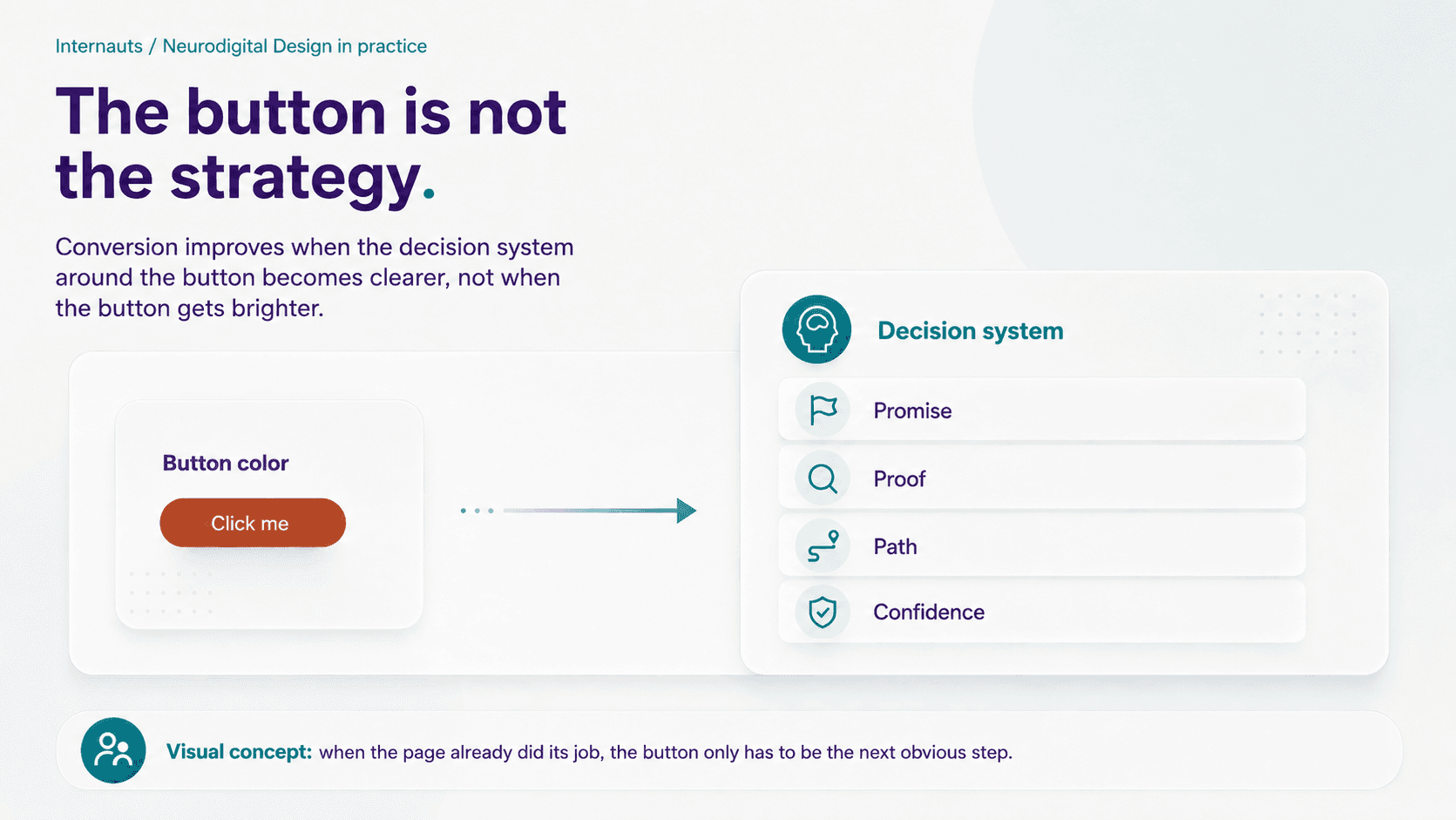
People do not click because a button is teal. They click because the experience has made the next step feel relevant, safe, timely and worth the effort. The button is not the decision. It is the visible tip of the decision.
Everything that happens before it determines whether the click feels obvious, risky, annoying, premature, confusing, or completely unnecessary. That is where most conversion conversations get too small. They obsess over the object everyone can see while ignoring the system that made the object matter in the first place.
In other words, conversion design is not just button color. It is decision design. And if we take the Neurodigital Design lens seriously, it is also something deeper: conversion is not a funnel.
It is a conversation.
The normal conversion conversation starts with the button
The traditional version of conversion design usually begins with the visible pieces: the headline, the hero section, the CTA, the form, the offer and, of course, the button color.
This is not wrong. These things matter. A weak headline can make a page irrelevant in three seconds. A vague CTA can create hesitation. A low-contrast button can disappear. A form with too many fields can kill momentum faster than a surprise meeting at 4:58 PM.
So yes, fix the basics. A good CTA should be visually clear. The primary action should look more important than the secondary action. The label should explain what happens next. “Get Started” is sometimes fine, but often it is just a polite shrug. “Book a Strategy Call,” “Start Your Application,” “Download the Guide,” or “See Pricing” gives the user more information and less guesswork.
The conventional advice is useful: make the CTA visible, give it strong contrast, use specific language, place it where the user is likely to be ready and repeat it when the page naturally needs another invitation.
All true. Also incomplete.
A visible button can still feel wrong. A specific CTA can still arrive too soon. A beautiful landing page can still fail because it asks for action before it has earned trust. That is the part most button-color debates miss.
The button can only finish the work the page has already done
A CTA does not create motivation from nothing. It completes a decision that has already been forming.
Before someone clicks, they are trying to understand whether the offer is for them, whether the organization feels credible, whether the next step is worth the effort and whether they are about to wander into a sales funnel wearing a friendly gradient.
Those questions are not decoration. They are the conversion path.
A strong conversion experience begins with a clear promise. The page has to explain why it exists and why the user should care. If the promise is vague, the CTA has to work too hard. “Get Started” under a generic headline is not a decision path. It is a guess with padding.
Then comes proof, because people need a reason to believe the promise before they commit to the next step. That proof might be a case study, a testimonial, a benchmark, a before-and-after example, a process explanation, a client result, an expert point of view, or a product demo. The format matters less than the placement. Proof should appear close to the claim it supports, not buried in a lonely section near the bottom called “Why Choose Us,” where trust goes to nap.
The path also has to make sense. People need to know where they are, what matters, what they can do next and what will happen after they act. A CTA should not feel like a cliff. It should feel like a door with a label.
Timing matters too. A CTA can appear too early, too late, too often, or in the wrong emotional moment. Early CTAs work when users already understand the value. Later CTAs work when the page needs to build context first. Repeated CTAs should not chant the same phrase every few sections like a desperate little sales ritual. They should match the user’s stage in the conversation.
Finally, the page needs to build confidence. Confidence is the emotional condition that makes action feel safe. It comes from clarity, transparency, process steps, pricing signals, contact details, confirmation language, accessible structure, easy back navigation and microcopy that reduces unknowns.
When these elements align, the button does not need to shout. The best button feels obvious because the page did its job.
Conversion is a conversation, not a funnel
This is where the usual sales-funnel thinking starts to break.
A funnel assumes the user should move through one controlled path toward one desired action. Bring them in, move them down, push the CTA, optimize the button. Very tidy. Very efficient. Very “get in the tube, little prospect.”
The problem is that people do not arrive on a website as generic traffic. They arrive with context.
A visitor might come in comparing options, quietly checking whether you are legitimate, ready to act but nervous about the next step, or interested enough to stay while still keeping one foot near the exit. Someone else may be reading on mobile between meetings, half-attentive, mildly suspicious and using one thumb to do the emotional labor of an entire UX department.
A funnel treats these people as if they are all entering the same machine. A Neurodesign approach treats them like humans arriving in different states. That distinction changes everything.
Once someone lands on your site, the experience should already have a strong guess about what they are looking for. Not in a creepy surveillance way. In a structural way.
A service page usually means someone is evaluating fit. A case study suggests they want proof. An article often means they are trying to understand the problem. A pricing page points to value comparison and risk. A campaign page carries the promise that brought them there, and the experience should not make them start over like they walked into the wrong building.
That is why strong websites need many landing pages, not one heroic homepage trying to do everything while slowly developing emotional damage.
Each entry point should behave like a front door for a specific need, context and state. Make it easy for people to find what they came for, then build trust, clarify the promise and offer the next step.
That next step is the button.
Not a trapdoor. Not a shove. Not a neon panic square screaming “BOOK NOW.” A clear invitation at the right moment.
That is not just conversion design. That is digital hospitality.
The Neurodesign layer: people arrive in states
Most conversion strategy talks about users as if they are stable. They are not.
The same person can be curious in the morning, skeptical at lunch, exhausted by afternoon and wildly intolerant of vague copy by 9:47 PM. People do not only bring intent. They bring state.
This is where Neurodigital Design changes the conversation. Instead of asking only what action we want the user to take, we also ask what condition the person is likely in when they arrive. That condition shapes how they read, trust, decide and act.
People do not arrive at a page in one universal state. They may be distracted, cautious, stressed, comparing options, or ready to act but unsure whether the next step is safe. Good conversion design accounts for that variation instead of forcing every visitor through the same rigid path.
Cognitive state asks how much mental effort the person can handle right now. Emotional state considers whether they are calm, curious, anxious, frustrated, hopeful, skeptical, or overwhelmed. Situational state looks at the device, environment, distraction, urgency, stress, or physical constraints surrounding the moment. Attention state asks how much focus is realistically available. Urgency state considers whether the person needs a quick answer, careful comparison, reassurance, or immediate completion. Trust state asks how safe, confident and willing they feel before taking the next step.
In real life, these states overlap. A person might arrive tired, skeptical, distracted, time-pressured and low on trust. That is not an edge case. That is Tuesday.
A strong conversion system accounts for this reality. It does not assume people will happily decode the page if they care enough. It does not force every visitor through the same generic path. It does not hide the button, but it also does not weaponize it.
Instead, it creates a path where the right user can recognize themselves, find what they need, understand the value, feel trust and choose the next step with confidence. That is the difference between pushing action and supporting action.
Why landing pages matter more than one perfect homepage
A homepage is often treated like the grand lobby of a website. And yes, the lobby matters. But not everyone enters through the lobby anymore.
People arrive from search, social, referrals, campaigns, articles, AI summaries, case studies, directories, ads, email links and very specific “I need this now” moments. If every one of those visitors gets thrown into the same generic page, you are making them restart the conversation.
That creates cognitive friction.
The better strategy is to build multiple clear entry points. A founder looking for a brand partner should not have to dig through the same path as a public agency looking for accessibility support. A person comparing services should not be forced through a manifesto before they understand the offer. A reader arriving from an article should not hit a CTA that assumes they are ready to book a call before they even trust the point of view.
Different entry points let the site behave with better manners. They allow the experience to say, “You came here for this. Start here.”
That is hospitality.
Not fluff. Not fake warmth. Not “Welcome, valued visitor” nonsense with a chatbot blocking half the screen. Real hospitality is structure. It anticipates need, reduces awkwardness, gives people options without making them feel abandoned and makes the next step visible without making the user feel chased.
Do not hide the button. Do not force it either.
There is a lazy version of “less salesy” design that hides the CTA so deeply the user needs a lantern and emotional support to find it. That is not better.
If the user is ready, the next step should be visible. But visibility is not the same as pressure.
A good CTA is present, specific and well-timed. It should be easy to find when someone is ready and easy to ignore when they are still evaluating. This is especially important for service businesses, public-sector sites, healthcare, education, nonprofits, B2B and any experience where the decision involves risk, money, personal information, trust, identity, urgency, or emotional weight.
In those moments, the button has a job: confirm the path, reduce uncertainty, explain the next step and respect the user’s timing.
That means the CTA should change depending on where the user is in the conversation. Early on, “See How It Works” may be more respectful than “Book Now.” When the user is comparing credibility, “View Examples” may do more work than a generic “Learn More.” At the decision point, “Book a Strategy Call” gives the next step a shape. Inside a form, “Send My Project Details” feels more specific than “Submit,” which is technically accurate but emotionally dead. After completion, “Check Your Inbox for Next Steps” keeps the conversation going instead of dropping the user into silence.
Each button answers a different moment. That is much better than repeating “Get Started” twelve times and hoping one of them eventually wears the user down.
A better way to audit conversion design
If your conversion strategy begins and ends with button color, the diagnosis is too shallow.
Start with the user’s decision journey. What does the visitor need to understand before acting? What needs to feel credible? Which fear, comparison, uncertainty, or effort is standing in the way? What state are they likely in when they arrive?
Then audit the page around the conversation, not just the CTA. Look at whether the entry point matches the user’s likely intent, whether the page explains itself quickly, whether proof appears close to the claims that need support and whether the CTA label tells people what happens next.
A stronger audit also looks at whether the experience supports different kinds of readers and decision-makers: scanners, skeptics, deep readers and ready-now users. It asks whether trust is being built before commitment is requested, whether attention and urgency are being respected and whether the button completes the conversation or interrupts it.
That last question matters most.
A button that interrupts the user is pressure. A button that completes the user’s thinking is guidance.
Where button color actually matters
Button color still matters. Let us not throw the poor button into traffic.
Color matters when it communicates priority. A primary action should be visually distinct from secondary actions. It should have enough contrast to be easy to find and read. It should not compete with decorative color elsewhere on the page. It should support hierarchy, accessibility and attention.
But color is one lever, not the whole machine.
If the promise is vague, the CTA color will not save it. If the proof is weak, the CTA color will not create trust. If the path is confusing, the CTA color will not create confidence. And if the page ignores the user’s state, the CTA color will not make the experience feel human.
The button can help people see the next step. It cannot make the next step meaningful by itself.
Final thoughts
Conversion design is not just button color. Button color is a visibility choice inside a larger decision system.
The real work is understanding why someone arrived, what state they are in, what they need to find, what they need to trust and what promise makes action feel worth it.
The old funnel model tries to push people toward action. A better Neurodesign model creates the conditions where action feels clear, confident and natural.
That means building stronger entry points, clearer paths, better proof, more respectful timing and CTAs that behave like invitations instead of traps.
A good button does not pressure people into action. It confirms the path they already understand.
And when the page has done its job, the click does not feel like a conversion trick. It feels like the next obvious step.
Want the button to work harder? Start by fixing the path before it.
Internauts helps teams design clearer, smarter digital experiences that reduce cognitive friction and make the next step easier to trust.
Button color is one of the easiest conversion conversations to have because it feels concrete. Orange feels urgent. Green feels friendly. Blue feels safe. Bigger feels bolder. Higher on the page feels more important.
Those changes can matter. A button should be visible, readable and hard to miss. It should not hide like it owes the user money.
But button color rarely fixes the real problem.
People do not click because a button is teal. They click because the experience has made the next step feel relevant, safe, timely and worth the effort. The button is not the decision. It is the visible tip of the decision.
Everything that happens before it determines whether the click feels obvious, risky, annoying, premature, confusing, or completely unnecessary. That is where most conversion conversations get too small. They obsess over the object everyone can see while ignoring the system that made the object matter in the first place.
In other words, conversion design is not just button color. It is decision design. And if we take the Neurodigital Design lens seriously, it is also something deeper: conversion is not a funnel.
It is a conversation.
The normal conversion conversation starts with the button
The traditional version of conversion design usually begins with the visible pieces: the headline, the hero section, the CTA, the form, the offer and, of course, the button color.
This is not wrong. These things matter. A weak headline can make a page irrelevant in three seconds. A vague CTA can create hesitation. A low-contrast button can disappear. A form with too many fields can kill momentum faster than a surprise meeting at 4:58 PM.
So yes, fix the basics. A good CTA should be visually clear. The primary action should look more important than the secondary action. The label should explain what happens next. “Get Started” is sometimes fine, but often it is just a polite shrug. “Book a Strategy Call,” “Start Your Application,” “Download the Guide,” or “See Pricing” gives the user more information and less guesswork.
The conventional advice is useful: make the CTA visible, give it strong contrast, use specific language, place it where the user is likely to be ready and repeat it when the page naturally needs another invitation.
All true. Also incomplete.
A visible button can still feel wrong. A specific CTA can still arrive too soon. A beautiful landing page can still fail because it asks for action before it has earned trust. That is the part most button-color debates miss.
The button can only finish the work the page has already done
A CTA does not create motivation from nothing. It completes a decision that has already been forming.
Before someone clicks, they are trying to understand whether the offer is for them, whether the organization feels credible, whether the next step is worth the effort and whether they are about to wander into a sales funnel wearing a friendly gradient.
Those questions are not decoration. They are the conversion path.
A strong conversion experience begins with a clear promise. The page has to explain why it exists and why the user should care. If the promise is vague, the CTA has to work too hard. “Get Started” under a generic headline is not a decision path. It is a guess with padding.
Then comes proof, because people need a reason to believe the promise before they commit to the next step. That proof might be a case study, a testimonial, a benchmark, a before-and-after example, a process explanation, a client result, an expert point of view, or a product demo. The format matters less than the placement. Proof should appear close to the claim it supports, not buried in a lonely section near the bottom called “Why Choose Us,” where trust goes to nap.
The path also has to make sense. People need to know where they are, what matters, what they can do next and what will happen after they act. A CTA should not feel like a cliff. It should feel like a door with a label.
Timing matters too. A CTA can appear too early, too late, too often, or in the wrong emotional moment. Early CTAs work when users already understand the value. Later CTAs work when the page needs to build context first. Repeated CTAs should not chant the same phrase every few sections like a desperate little sales ritual. They should match the user’s stage in the conversation.
Finally, the page needs to build confidence. Confidence is the emotional condition that makes action feel safe. It comes from clarity, transparency, process steps, pricing signals, contact details, confirmation language, accessible structure, easy back navigation and microcopy that reduces unknowns.
When these elements align, the button does not need to shout. The best button feels obvious because the page did its job.
Conversion is a conversation, not a funnel
This is where the usual sales-funnel thinking starts to break.
A funnel assumes the user should move through one controlled path toward one desired action. Bring them in, move them down, push the CTA, optimize the button. Very tidy. Very efficient. Very “get in the tube, little prospect.”
The problem is that people do not arrive on a website as generic traffic. They arrive with context.
A visitor might come in comparing options, quietly checking whether you are legitimate, ready to act but nervous about the next step, or interested enough to stay while still keeping one foot near the exit. Someone else may be reading on mobile between meetings, half-attentive, mildly suspicious and using one thumb to do the emotional labor of an entire UX department.
A funnel treats these people as if they are all entering the same machine. A Neurodesign approach treats them like humans arriving in different states. That distinction changes everything.
Once someone lands on your site, the experience should already have a strong guess about what they are looking for. Not in a creepy surveillance way. In a structural way.
A service page usually means someone is evaluating fit. A case study suggests they want proof. An article often means they are trying to understand the problem. A pricing page points to value comparison and risk. A campaign page carries the promise that brought them there, and the experience should not make them start over like they walked into the wrong building.
That is why strong websites need many landing pages, not one heroic homepage trying to do everything while slowly developing emotional damage.
Each entry point should behave like a front door for a specific need, context and state. Make it easy for people to find what they came for, then build trust, clarify the promise and offer the next step.
That next step is the button.
Not a trapdoor. Not a shove. Not a neon panic square screaming “BOOK NOW.” A clear invitation at the right moment.
That is not just conversion design. That is digital hospitality.
The Neurodesign layer: people arrive in states
Most conversion strategy talks about users as if they are stable. They are not.
The same person can be curious in the morning, skeptical at lunch, exhausted by afternoon and wildly intolerant of vague copy by 9:47 PM. People do not only bring intent. They bring state.
This is where Neurodigital Design changes the conversation. Instead of asking only what action we want the user to take, we also ask what condition the person is likely in when they arrive. That condition shapes how they read, trust, decide and act.
People do not arrive at a page in one universal state. They may be distracted, cautious, stressed, comparing options, or ready to act but unsure whether the next step is safe. Good conversion design accounts for that variation instead of forcing every visitor through the same rigid path.
Cognitive state asks how much mental effort the person can handle right now. Emotional state considers whether they are calm, curious, anxious, frustrated, hopeful, skeptical, or overwhelmed. Situational state looks at the device, environment, distraction, urgency, stress, or physical constraints surrounding the moment. Attention state asks how much focus is realistically available. Urgency state considers whether the person needs a quick answer, careful comparison, reassurance, or immediate completion. Trust state asks how safe, confident and willing they feel before taking the next step.
In real life, these states overlap. A person might arrive tired, skeptical, distracted, time-pressured and low on trust. That is not an edge case. That is Tuesday.
A strong conversion system accounts for this reality. It does not assume people will happily decode the page if they care enough. It does not force every visitor through the same generic path. It does not hide the button, but it also does not weaponize it.
Instead, it creates a path where the right user can recognize themselves, find what they need, understand the value, feel trust and choose the next step with confidence. That is the difference between pushing action and supporting action.
Why landing pages matter more than one perfect homepage
A homepage is often treated like the grand lobby of a website. And yes, the lobby matters. But not everyone enters through the lobby anymore.
People arrive from search, social, referrals, campaigns, articles, AI summaries, case studies, directories, ads, email links and very specific “I need this now” moments. If every one of those visitors gets thrown into the same generic page, you are making them restart the conversation.
That creates cognitive friction.
The better strategy is to build multiple clear entry points. A founder looking for a brand partner should not have to dig through the same path as a public agency looking for accessibility support. A person comparing services should not be forced through a manifesto before they understand the offer. A reader arriving from an article should not hit a CTA that assumes they are ready to book a call before they even trust the point of view.
Different entry points let the site behave with better manners. They allow the experience to say, “You came here for this. Start here.”
That is hospitality.
Not fluff. Not fake warmth. Not “Welcome, valued visitor” nonsense with a chatbot blocking half the screen. Real hospitality is structure. It anticipates need, reduces awkwardness, gives people options without making them feel abandoned and makes the next step visible without making the user feel chased.
Do not hide the button. Do not force it either.
There is a lazy version of “less salesy” design that hides the CTA so deeply the user needs a lantern and emotional support to find it. That is not better.
If the user is ready, the next step should be visible. But visibility is not the same as pressure.
A good CTA is present, specific and well-timed. It should be easy to find when someone is ready and easy to ignore when they are still evaluating. This is especially important for service businesses, public-sector sites, healthcare, education, nonprofits, B2B and any experience where the decision involves risk, money, personal information, trust, identity, urgency, or emotional weight.
In those moments, the button has a job: confirm the path, reduce uncertainty, explain the next step and respect the user’s timing.
That means the CTA should change depending on where the user is in the conversation. Early on, “See How It Works” may be more respectful than “Book Now.” When the user is comparing credibility, “View Examples” may do more work than a generic “Learn More.” At the decision point, “Book a Strategy Call” gives the next step a shape. Inside a form, “Send My Project Details” feels more specific than “Submit,” which is technically accurate but emotionally dead. After completion, “Check Your Inbox for Next Steps” keeps the conversation going instead of dropping the user into silence.
Each button answers a different moment. That is much better than repeating “Get Started” twelve times and hoping one of them eventually wears the user down.
A better way to audit conversion design
If your conversion strategy begins and ends with button color, the diagnosis is too shallow.
Start with the user’s decision journey. What does the visitor need to understand before acting? What needs to feel credible? Which fear, comparison, uncertainty, or effort is standing in the way? What state are they likely in when they arrive?
Then audit the page around the conversation, not just the CTA. Look at whether the entry point matches the user’s likely intent, whether the page explains itself quickly, whether proof appears close to the claims that need support and whether the CTA label tells people what happens next.
A stronger audit also looks at whether the experience supports different kinds of readers and decision-makers: scanners, skeptics, deep readers and ready-now users. It asks whether trust is being built before commitment is requested, whether attention and urgency are being respected and whether the button completes the conversation or interrupts it.
That last question matters most.
A button that interrupts the user is pressure. A button that completes the user’s thinking is guidance.
Where button color actually matters
Button color still matters. Let us not throw the poor button into traffic.
Color matters when it communicates priority. A primary action should be visually distinct from secondary actions. It should have enough contrast to be easy to find and read. It should not compete with decorative color elsewhere on the page. It should support hierarchy, accessibility and attention.
But color is one lever, not the whole machine.
If the promise is vague, the CTA color will not save it. If the proof is weak, the CTA color will not create trust. If the path is confusing, the CTA color will not create confidence. And if the page ignores the user’s state, the CTA color will not make the experience feel human.
The button can help people see the next step. It cannot make the next step meaningful by itself.
Final thoughts
Conversion design is not just button color. Button color is a visibility choice inside a larger decision system.
The real work is understanding why someone arrived, what state they are in, what they need to find, what they need to trust and what promise makes action feel worth it.
The old funnel model tries to push people toward action. A better Neurodesign model creates the conditions where action feels clear, confident and natural.
That means building stronger entry points, clearer paths, better proof, more respectful timing and CTAs that behave like invitations instead of traps.
A good button does not pressure people into action. It confirms the path they already understand.
And when the page has done its job, the click does not feel like a conversion trick. It feels like the next obvious step.
Want the button to work harder? Start by fixing the path before it.
Internauts helps teams design clearer, smarter digital experiences that reduce cognitive friction and make the next step easier to trust.


Discover more about high-performance web design. Follow us on LinkedIn and Instagram.