
Why AI Illustrations Still Need Human Taste
AI can generate images fast. But memorable brand visuals still need taste, direction and a human who knows what they are doing.

Internauts Editorial
Client Success. When we are not crafting, we write
Why AI Illustrations Still Need Human Taste
AI can generate images fast. But memorable brand visuals still need taste, direction and a human who knows what they are doing.
Internauts Editorial
Client Success. When we are not crafting, we write
AI has made illustration more accessible than ever. That is good news. The bad news? Faster does not mean better. If you want brand images that feel distinct, useful and worth remembering, AI needs direction, taste and strategy. Otherwise, congratulations, you made premium-flavored digital oatmeal.
AI changed the tool. It did not replace the eye.
In our first article, Why Custom Illustrations Make Brands More Memorable, we talked about how custom illustration helps brands create something harder to copy: a visual memory.
Now let’s talk about the AI elephant in the room.
Every week, a new platform appears promising to “change the way creatives work forever.” A new model drops. A new workflow goes viral. A new demo makes everyone briefly question their career choices before remembering the demo was probably made by someone with 15 years of taste and a lighting reference folder organized like a NASA launch system.
AI is powerful. No debate there.
But the AI most of us normal mongrels have access to is still a tool. And like any tool, it is only as good as the expertise behind it.
A hammer has dozens of uses, but it does not decide what to build. Same case here. AI can generate, remix, extend and accelerate, but it still needs someone with direction, taste and intent holding the handle.
What’s the cause?
The problem is not that people are using AI for brand imagery.
The problem is that too many people are using AI without direction.
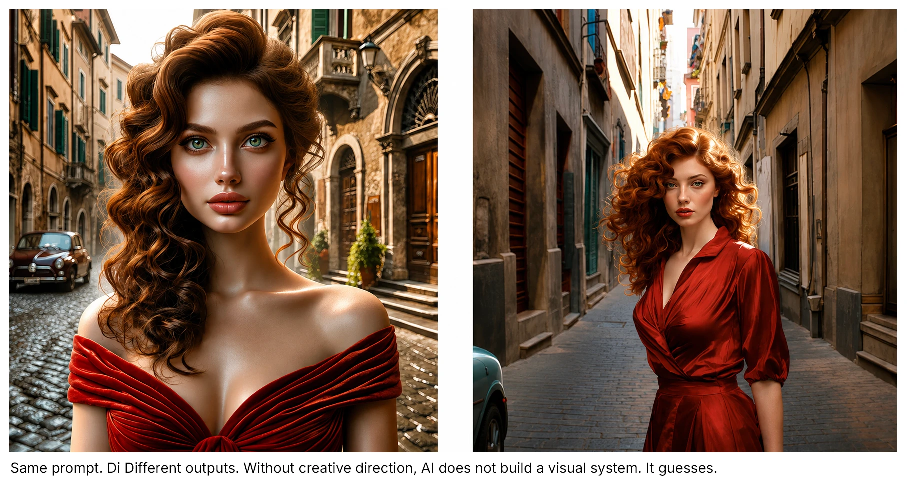
They type a prompt, get something shiny and call it a brand asset. The image may look polished at first glance, but polished is not the same as specific. Pretty is not the same as meaningful. And “cool” is not a strategy, no matter how many neon gradients are involved.
This is where brands get into trouble.
AI can give you endless styles, but it cannot automatically know what your audience should feel, what your brand should stand for, or what kind of visual world your business needs to own.
That part is still human.
That part requires taste.
And taste is not magic. It is acquired.
Taste is developed through exposure, immersion, practice, observation, critique and knowledge. It comes from seeing a lot, making a lot, failing a lot and slowly learning why one image feels alive while another looks like a rejected loading screen from a startup pitch deck.
AI gives you access to styles as if someone handed you a giant visual library.
Great.
But the rest is direction.
How to use AI illustrations without making your brand look generic
Start with the brand, not the prompt
Before you generate anything, know what the image needs to do.
Is it supposed to explain? Attract? Guide? Reassure? Entertain? Sell? Create belonging? Make someone pause?
A good prompt starts with intent, not decoration.
Weak direction sounds like: “Create a futuristic illustration for a brand.”
Better direction sounds like: “Create a warm, slightly rebellious illustration for a creative studio that helps founders reduce digital friction. The image should feel smart, welcoming and a little strange, not corporate or tech-bro.”
That is already better because it gives the tool something to aim at.
AI does not read your mind. Annoying, yes. But probably good for civilization.
Build a visual point of view
Do not chase every new AI style like a raccoon with a Wi-Fi password.
Pick a lane.
Your brand imagery should have rules. Not boring rules. Useful ones.
Think about:
Color behavior
Character style
Level of detail
Texture
Lighting
Mood
Composition
Symbolism
How abstract or literal the visuals should be
What the brand should never look like
The goal is not to generate one good image. The goal is to build a visual system people can recognize.
A brand that changes visual style every week does not look experimental. It looks confused.
Use references, but do not become a copy machine
AI works better when you give it strong references. But there is a difference between inspiration and creative shoplifting with better file names.
References should help define the ingredients:
• Mood
• Composition
• Color
• Visual era
• Texture
• Level of realism
• Emotional tone
They should not become a shortcut to cloning another artist, brand or campaign.
The smarter move is to combine influences into something ownable.
Think less: “Make it like this.”
Think more: “Use this kind of lighting, this sense of movement, this level of simplicity and this emotional tone.”
That is direction. That is taste doing push-ups.
Edit harder than you generate
AI makes it easy to produce more.
That does not mean you should use more.
The real work is selection. Curation. Editing. Knowing when something feels off, even if you cannot explain it immediately. Knowing when the image is technically impressive but emotionally empty.
This is the skill that separates great work from the rest.
Editing away what gets in the way is just as important as deciding what stays. The stronger the visual system, the less it tries to show everything. It knows what matters, removes what does not, and gives the audience a clear signal instead of a visual pileup.
Ask:
Does this feel like our brand?
Does this make the idea clearer?
Does this respect the audience?
Does it look like everyone else using the same tool?
Would people remember this tomorrow?
Is it beautiful for a reason, or just shiny?
What can we remove without weakening the message?
If the image does not support meaning, it is decoration.
And decoration without intention is where brands go to become wallpaper.
Avoid the AI sameness trap
You know the look.
Glossy. Over-rendered. Perfectly lit. Vaguely cinematic. Attractive but empty. Everyone has flawless skin, every object glows, every background looks like it was sponsored by “Innovation.”
That style has its place, but too much of it makes your brand feel like it was assembled from a prompt pack called Premium Future Business Vibes Vol. 7.
To avoid sameness, add constraints.
Constraints create character.
Try asking for:
Imperfection
Specific materials
Strange but relevant metaphors
Unusual compositions
Simpler shapes
More negative space
Local or cultural specificity
Real human behavior
Visual tension
A clear emotional state
Generic prompts create generic images.
Specific direction creates memory.
Treat AI like a collaborator, not a creative director
AI can help you explore faster. It can help you test styles, generate moodboards, sketch concepts, create variations and get unstuck.
But it should not be making the final brand decisions.
That is your job.
Or ours, conveniently. Funny how that works.
The best AI-assisted visual work still needs someone asking better questions:
What are we trying to say?
Who is this for?
What should they feel?
What should they remember?
Where will this image live?
What does this image need to do in the larger system?
Without those questions, AI becomes a vending machine for visual noise.
With those questions, it becomes a serious creative accelerator.
Need Better AI Image Prompts for Your Brand?
If you want to try generating your own brand images but do not have the time to become a full-time prompt engineer, we built Prompster®.
Prompster® is our custom GPT designed to help you create stronger, clearer, more useful prompts for image generation projects. It helps translate your creative direction into prompts that work across most AI tools and language models, including ChatGPT, Claude, Gemini, Nano Banana, Perplexity and other creative AI platforms.
Because here’s the thing: better prompts do not come from longer prompts.
They come from better thinking.
Prompster® helps you define the intent, style, mood, audience, references, constraints and output requirements before you hit generate and pray to the pixel gods.
It will not replace taste.
But it can help you stop prompting like there is no tomorrow. It's free and you can find it here
Common AI image generation tools worth knowing
The tool landscape changes constantly, because apparently the internet looked at “overwhelming” and said, “cute, let’s add subscriptions.” But these are some of the most common platforms people are using right now:
ChatGPT / OpenAI Images: Prompt-based image creation, editing and strong conversational direction.
Midjourney: Stylized, cinematic, artistic and concept-heavy visuals. Strong for mood, atmosphere and visual richness.
Adobe Firefly: Commercial workflows, image editing and integration with Adobe tools. Useful for teams already living in Adobe land.
Google Gemini / Nano Banana: Conversational image generation and editing inside Gemini-style workflows.
Canva Magic Media: Quick marketing visuals, social posts, presentations and easy design workflows for non-designers.
Ideogram: Graphic design style images, posters, logos and visuals where text rendering matters.
Leonardo.Ai: High-volume image generation, concept art, custom aesthetics and scalable visual exploration.
Runway: AI image and video workflows, motion experiments and creative production pipelines.
Stable Diffusion / Flux-based tools: Advanced control, custom models, local workflows and technical experimentation. Better for teams who know what they are doing and enjoy suffering productively.
Freepik AI / Krea / Playground-style tools: Fast concepting, visual exploration, social graphics and inspiration boards. Useful for quick experiments, but still needs direction.
The best tool depends on what you need.
Midjourney is strong for visual mood. Ideogram is useful for text-heavy graphics.
Firefly fits commercial workflows.
Stable Diffusion-style tools offer more control.
Canva helps with quick marketing assets.
ChatGPT and Gemini-style tools are useful for conversational generation, iteration and creative direction.
But the tool is never the strategy.
The tool makes the thing. Taste decides if the thing should exist.
Final Thoughts
AI can help you make brand images faster. But faster is not the same as memorable.
If you want to DIY your brand visuals, use AI with intention. Build a visual point of view. Train your taste. Edit aggressively. Stay specific.
And please, for the love of pixels, do not let a generic image tell your audience you did not care enough to make something for them.
Because people can feel that.
And when they do, they bounce… and if you think getting to your website is expensive, imagine how much more costly is to bring them back once they have a bad perception of your brand.
AI changed the tool. It did not replace the eye.
In our first article, Why Custom Illustrations Make Brands More Memorable, we talked about how custom illustration helps brands create something harder to copy: a visual memory.
Now let’s talk about the AI elephant in the room.
Every week, a new platform appears promising to “change the way creatives work forever.” A new model drops. A new workflow goes viral. A new demo makes everyone briefly question their career choices before remembering the demo was probably made by someone with 15 years of taste and a lighting reference folder organized like a NASA launch system.
AI is powerful. No debate there.
But the AI most of us normal mongrels have access to is still a tool. And like any tool, it is only as good as the expertise behind it.
A hammer has dozens of uses, but it does not decide what to build. Same case here. AI can generate, remix, extend and accelerate, but it still needs someone with direction, taste and intent holding the handle.
What’s the cause?
The problem is not that people are using AI for brand imagery.
The problem is that too many people are using AI without direction.
They type a prompt, get something shiny and call it a brand asset. The image may look polished at first glance, but polished is not the same as specific. Pretty is not the same as meaningful. And “cool” is not a strategy, no matter how many neon gradients are involved.
This is where brands get into trouble.
AI can give you endless styles, but it cannot automatically know what your audience should feel, what your brand should stand for, or what kind of visual world your business needs to own.
That part is still human.
That part requires taste.
And taste is not magic. It is acquired.
Taste is developed through exposure, immersion, practice, observation, critique and knowledge. It comes from seeing a lot, making a lot, failing a lot and slowly learning why one image feels alive while another looks like a rejected loading screen from a startup pitch deck.
AI gives you access to styles as if someone handed you a giant visual library.
Great.
But the rest is direction.
How to use AI illustrations without making your brand look generic
Start with the brand, not the prompt
Before you generate anything, know what the image needs to do.
Is it supposed to explain? Attract? Guide? Reassure? Entertain? Sell? Create belonging? Make someone pause?
A good prompt starts with intent, not decoration.
Weak direction sounds like: “Create a futuristic illustration for a brand.”
Better direction sounds like: “Create a warm, slightly rebellious illustration for a creative studio that helps founders reduce digital friction. The image should feel smart, welcoming and a little strange, not corporate or tech-bro.”
That is already better because it gives the tool something to aim at.
AI does not read your mind. Annoying, yes. But probably good for civilization.
Build a visual point of view
Do not chase every new AI style like a raccoon with a Wi-Fi password.
Pick a lane.
Your brand imagery should have rules. Not boring rules. Useful ones.
Think about:
Color behavior
Character style
Level of detail
Texture
Lighting
Mood
Composition
Symbolism
How abstract or literal the visuals should be
What the brand should never look like
The goal is not to generate one good image. The goal is to build a visual system people can recognize.
A brand that changes visual style every week does not look experimental. It looks confused.
Use references, but do not become a copy machine
AI works better when you give it strong references. But there is a difference between inspiration and creative shoplifting with better file names.
References should help define the ingredients:
• Mood
• Composition
• Color
• Visual era
• Texture
• Level of realism
• Emotional tone
They should not become a shortcut to cloning another artist, brand or campaign.
The smarter move is to combine influences into something ownable.
Think less: “Make it like this.”
Think more: “Use this kind of lighting, this sense of movement, this level of simplicity and this emotional tone.”
That is direction. That is taste doing push-ups.
Edit harder than you generate
AI makes it easy to produce more.
That does not mean you should use more.
The real work is selection. Curation. Editing. Knowing when something feels off, even if you cannot explain it immediately. Knowing when the image is technically impressive but emotionally empty.
This is the skill that separates great work from the rest.
Editing away what gets in the way is just as important as deciding what stays. The stronger the visual system, the less it tries to show everything. It knows what matters, removes what does not, and gives the audience a clear signal instead of a visual pileup.
Ask:
Does this feel like our brand?
Does this make the idea clearer?
Does this respect the audience?
Does it look like everyone else using the same tool?
Would people remember this tomorrow?
Is it beautiful for a reason, or just shiny?
What can we remove without weakening the message?
If the image does not support meaning, it is decoration.
And decoration without intention is where brands go to become wallpaper.
Avoid the AI sameness trap
You know the look.
Glossy. Over-rendered. Perfectly lit. Vaguely cinematic. Attractive but empty. Everyone has flawless skin, every object glows, every background looks like it was sponsored by “Innovation.”
That style has its place, but too much of it makes your brand feel like it was assembled from a prompt pack called Premium Future Business Vibes Vol. 7.
To avoid sameness, add constraints.
Constraints create character.
Try asking for:
Imperfection
Specific materials
Strange but relevant metaphors
Unusual compositions
Simpler shapes
More negative space
Local or cultural specificity
Real human behavior
Visual tension
A clear emotional state
Generic prompts create generic images.
Specific direction creates memory.
Treat AI like a collaborator, not a creative director
AI can help you explore faster. It can help you test styles, generate moodboards, sketch concepts, create variations and get unstuck.
But it should not be making the final brand decisions.
That is your job.
Or ours, conveniently. Funny how that works.
The best AI-assisted visual work still needs someone asking better questions:
What are we trying to say?
Who is this for?
What should they feel?
What should they remember?
Where will this image live?
What does this image need to do in the larger system?
Without those questions, AI becomes a vending machine for visual noise.
With those questions, it becomes a serious creative accelerator.
Need Better AI Image Prompts for Your Brand?
If you want to try generating your own brand images but do not have the time to become a full-time prompt engineer, we built Prompster®.
Prompster® is our custom GPT designed to help you create stronger, clearer, more useful prompts for image generation projects. It helps translate your creative direction into prompts that work across most AI tools and language models, including ChatGPT, Claude, Gemini, Nano Banana, Perplexity and other creative AI platforms.
Because here’s the thing: better prompts do not come from longer prompts.
They come from better thinking.
Prompster® helps you define the intent, style, mood, audience, references, constraints and output requirements before you hit generate and pray to the pixel gods.
It will not replace taste.
But it can help you stop prompting like there is no tomorrow. It's free and you can find it here
Common AI image generation tools worth knowing
The tool landscape changes constantly, because apparently the internet looked at “overwhelming” and said, “cute, let’s add subscriptions.” But these are some of the most common platforms people are using right now:
ChatGPT / OpenAI Images: Prompt-based image creation, editing and strong conversational direction.
Midjourney: Stylized, cinematic, artistic and concept-heavy visuals. Strong for mood, atmosphere and visual richness.
Adobe Firefly: Commercial workflows, image editing and integration with Adobe tools. Useful for teams already living in Adobe land.
Google Gemini / Nano Banana: Conversational image generation and editing inside Gemini-style workflows.
Canva Magic Media: Quick marketing visuals, social posts, presentations and easy design workflows for non-designers.
Ideogram: Graphic design style images, posters, logos and visuals where text rendering matters.
Leonardo.Ai: High-volume image generation, concept art, custom aesthetics and scalable visual exploration.
Runway: AI image and video workflows, motion experiments and creative production pipelines.
Stable Diffusion / Flux-based tools: Advanced control, custom models, local workflows and technical experimentation. Better for teams who know what they are doing and enjoy suffering productively.
Freepik AI / Krea / Playground-style tools: Fast concepting, visual exploration, social graphics and inspiration boards. Useful for quick experiments, but still needs direction.
The best tool depends on what you need.
Midjourney is strong for visual mood. Ideogram is useful for text-heavy graphics.
Firefly fits commercial workflows.
Stable Diffusion-style tools offer more control.
Canva helps with quick marketing assets.
ChatGPT and Gemini-style tools are useful for conversational generation, iteration and creative direction.
But the tool is never the strategy.
The tool makes the thing. Taste decides if the thing should exist.
Final Thoughts
AI can help you make brand images faster. But faster is not the same as memorable.
If you want to DIY your brand visuals, use AI with intention. Build a visual point of view. Train your taste. Edit aggressively. Stay specific.
And please, for the love of pixels, do not let a generic image tell your audience you did not care enough to make something for them.
Because people can feel that.
And when they do, they bounce… and if you think getting to your website is expensive, imagine how much more costly is to bring them back once they have a bad perception of your brand.

Discover more about high-performance web design. Follow us on LinkedIn and Instagram.